- What makes an ad banner
- Standard banner formats and sizes in 2020
- Online tools for creating ad banners
Do you need a professional banner for your online advertising campaign? We have good news for you! You can create a good-looking banner all by yourself in just a few minutes. Plus, it’s absolutely free! Read on to find out how to do it. You’ll learn about the standard banner formats and sizes, key elements that make a banner, and effective ways to grab the attention of your target audience.
What makes an ad banner
You have less than three seconds to command the attention of a user who’s scrolling down their social media media or Google page with search results. This is why it’s important to make each element of your banner count. Let’s see what elements make an ad banner and how major brands use them to their advantage.
Brand identity
Since an ad banner is a part of your company’s branding, it must go in line with your corporate style. This is a sureway way to distinguish your brand from competitors, boost your recognition, and acquire more loyal clients. Here are the main elements that every ad banner must have:
- company name;
- logo;
- colors;
- fonts.
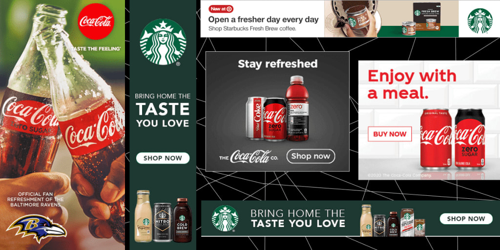
For example, the company’s mascot (a siren) and green background are the essential parts of every Starbucks banner. Another top-tier brand, Coca-Cola, always uses its iconic handwritten font and red color.
Text
Your banner text must be clear, concise, and easy-to-understand. First of all, you need to determine the goal that you’re pursuing with your banner. For example, you might want to present a new product, improve your image, or tell your customers about a promotion. Make sure your choice of words and overall style of communication suit your target audience.
As the next step, proceed to writing a text for your banner. Stick to the principle “less is more”. Here is another useful tip that will make the work easier for you. Write several versions of your text, pick the best one, and focus on improving it. Your goal is to make your message succinct and yet crystal clear.
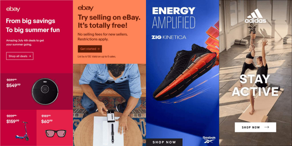
Take a look at how popular brands manage their ad banners. For example, eBay lures in small businesses with propositions like: “Try selling on eBay. It’s absolutely free!” and “Open your eBay store now”. Addressing their young and dynamic audience, Adidas uses short, concise slogans like “Enhanced energy” or “Stay active”.
Images
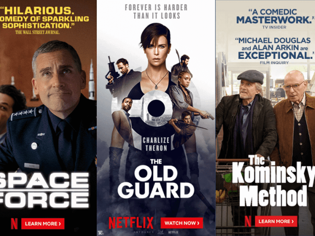
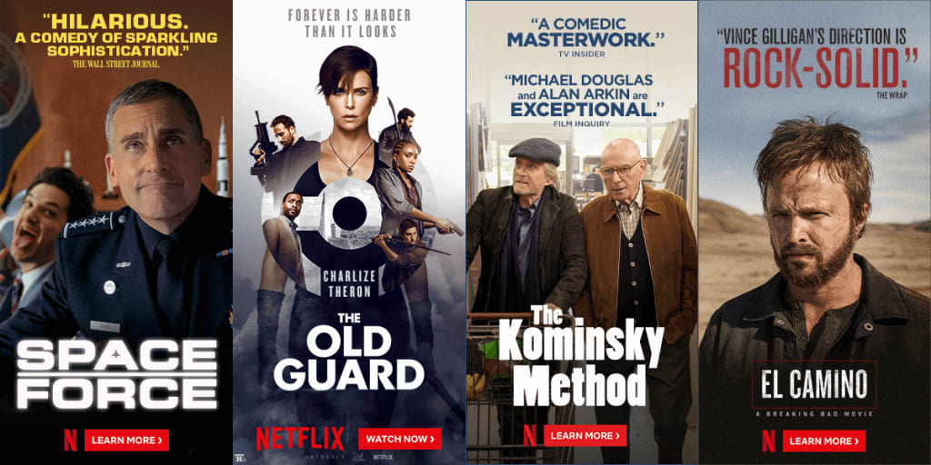
Photos, illustrations and graphics are the fundamental part of any ad banner. It’s a great way to attract the attention of Internet users. For their online banners, Netflix uses movie posters, while Nike relies on close-ups of their sneakers. This is what you need to remember when choosing the right graphics for your banner:
- Brand identity. The visual style of your banner must match your company’s brand identity.
- One image for one banner. Usually, it would be a specific product that you’re promoting.
- High quality. Avoid using blurry or low-definition images. On a large banner, such graphics will turn into a sad illegible stain.

CTA
СТА stands for Call To Action. It’s the key element of your banner that spurs users to perform a certain action, e.g. go to the website, read more information, buy a product, etc. When working on your СТА text, it’s important to understand what you want your potential clients to do and what relationship you have with your audience.
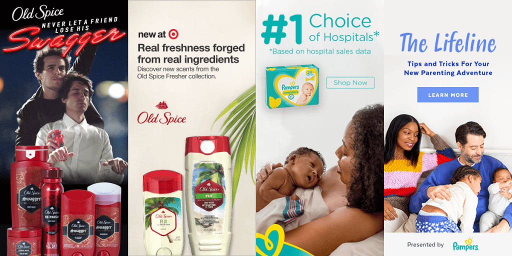
- Use “Buy” or “Buy Now” button when dealing with a “warm” audience on online platforms where your brand is well-known. It’s a good option for budget-friendly brands, such as Pampers, Old Spice or Uniqlo.
- When talking to a “cold” audience, try to win their trust by using milder phrases, such as “Learn more”, “Download a free checklist”, “Sign up for a webinar”, etc. For example, Cadillac invites users to take a look at their new car (“Get to know CT5”) by visiting their official website.
- Alternatively, you can replace the somewhat obtrusive ”Buy” button with more subtle and creative CTA phrases. For example, Starbucks encourages its clients to “Enjoy now” and “Refuel right now”.
Hee are a few more tips for creating a smart CTA button:
- Clear proposal. Users must get a clear idea of what they’ll get after clicking the CTA button.
- One CTA. If your banner has more than one CTA button, it may confuse users.
- Eye-catching design. Use bright, contrasting colors and thick font.
Standard banner formats and sizes in 2020
The size of your banner is determined by several factors, including the online platform you’re using, contents of your banner, and your target audience.
- To pick the right size for your banner, follow the international standards developed by the Interactive Advertising Bureau (IAB). IAB came up with relevant guidelines for banners published on Google, major social media, and other platforms.
- Launch several banners in different formats and see which one drives more traffic.
- Make sure your banner displays correctly across different devices, from smartphones to PCs.
Online banners come in a variety of formats. For the full list, go to the IAB website. We’ve selected three most popular formats:
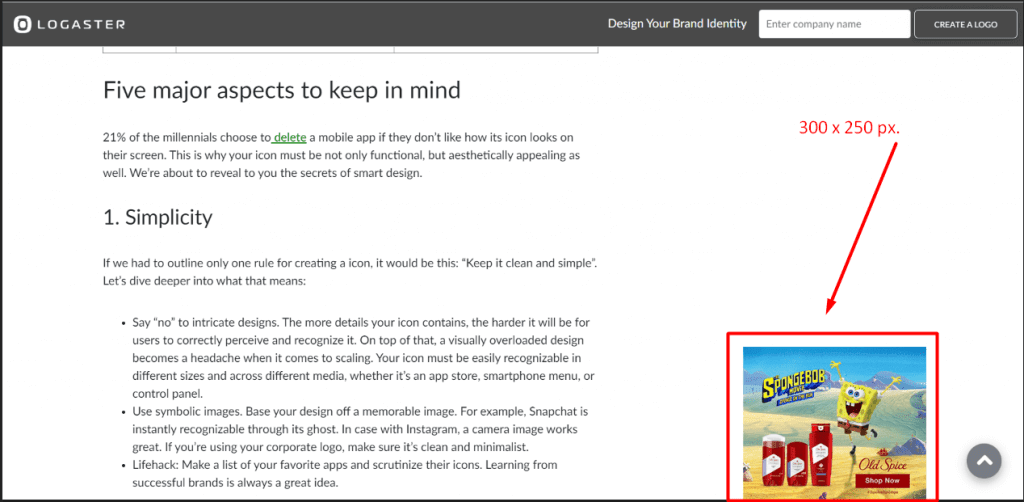
- Medium-size rectangle (300×250). It’s a highly versatile – and therefore costly – format that displays well across both desktops and mobile devices.
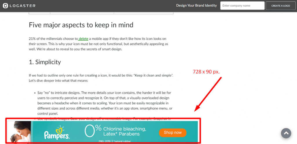
- Narrow horizontal block (728×90 for PCs; 320х50 for smartphones). This banner will fit into your website header or article.
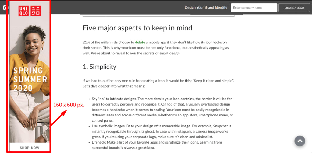
- Vertical block (160х600). This banner is displayed to the side of the main content on a website page.
Online tools for creating ad banners
If you have zero experience in graphic design or lack the budget to hire a professional designer, you can use smart online services that will help you create all kinds of graphic content, including banners for online advertising. Let’s see how you can easily generate an online banner with the Abyssale service.
Language
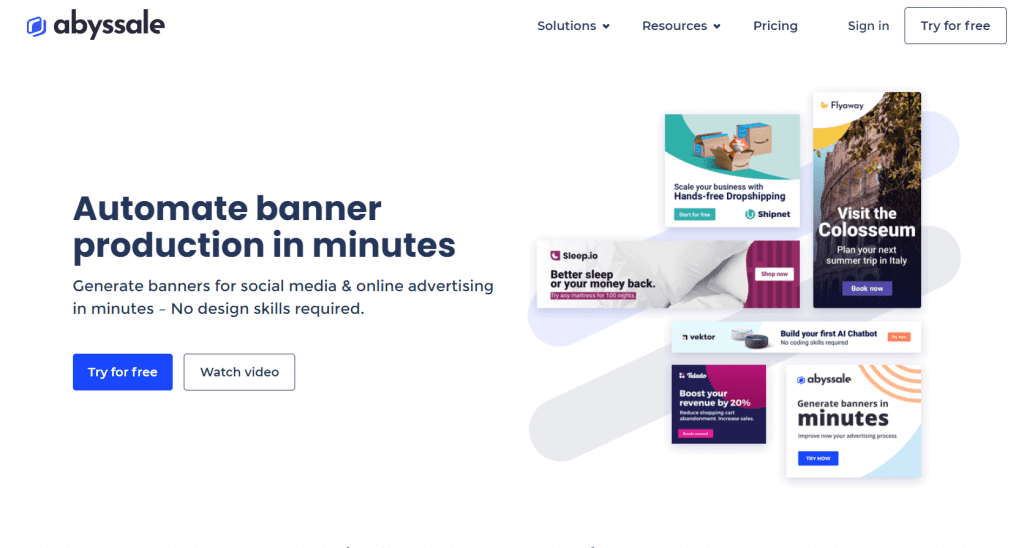
The Abyssale platform supports two languages, English and French.
Registration
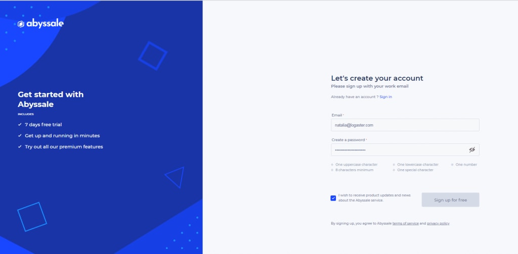
To sign up, you need to submit your email address and password. As the next step, you’ll be asked to enter your name, position, company industry, and name of the project you’re working on at the moment.
Tools
Abyssale makes a banner making process simple and straightforward. Upload the elements (image, font, colors, etc.) for your banner, and Abyssale will offer you dozens of relevant and visually appealing designs that fit your advertising campaign. All options are customizable.
Templates
You won’t find ready-to-use templates on Abyssale. Instead, you’ll have to create your banner from scratch. But don’t worry. The service has an intuitive interface and will guide you through the banner making process.
Formats and sizes
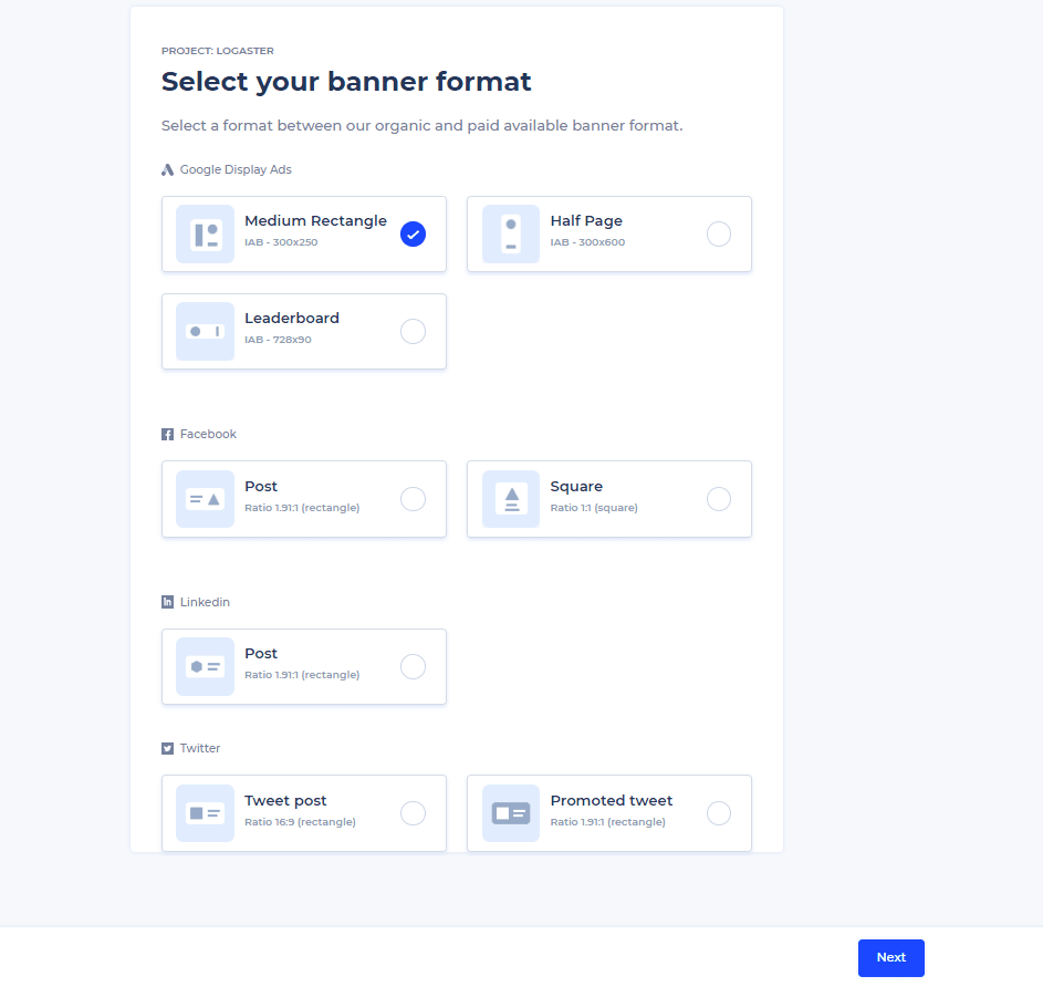
With Abyssale, you can create IAB-compliant banners for the following platforms:
- Google Ads (300х250, 300х600 or 728х90);
- Facebook (rectangle 1.91:1 or square 1:1);
- LinkedIn (1.91:1);
- Twitter (16:9 or 1,91:1).
Branding
If your banner contains a logo, upload it to the Abyssale website. The platform supports files in SVG and PNG. Smart algorithms will ensure that your logo fits your banner in terms of size and proportions.
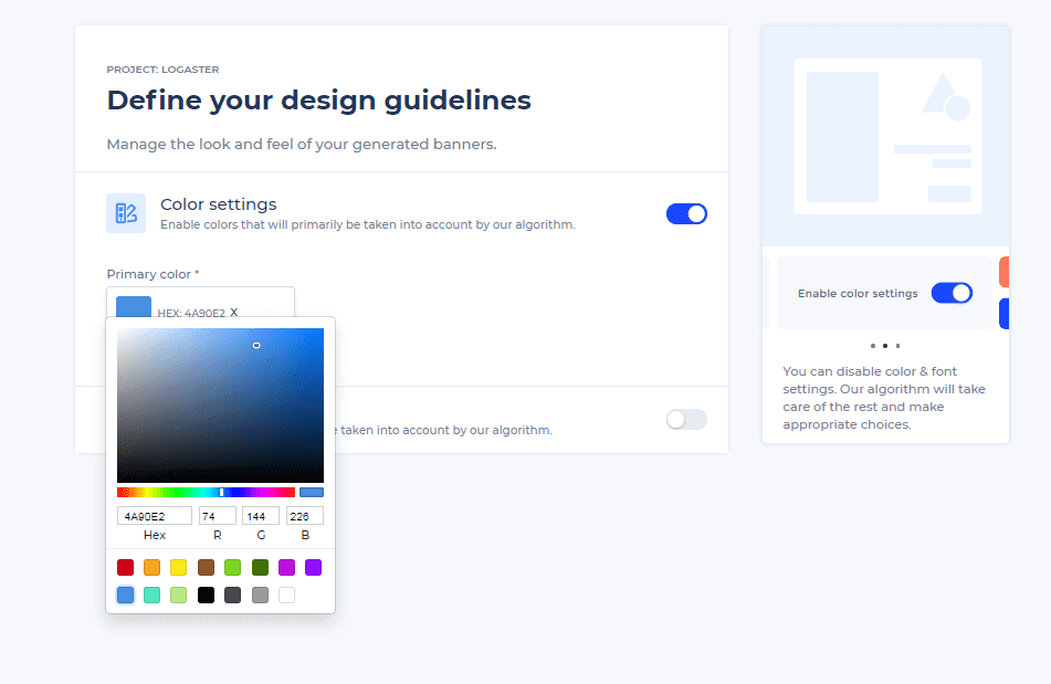
If you’ve already set your corporate colors and fonts, the service will use them in your banner by default. If you haven’t selected your color scheme and typography yet, proceed to the next step.
Colors and fonts
Use the Google library to select the best colors and typefaces for your banner. Then type in the headline, main text, and CTA text. Keep in mind that both the headline and main text must be up to 90 characters long.
Image
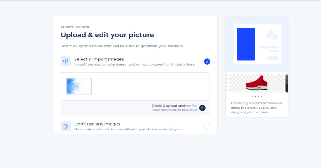
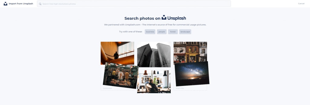
You can upload any photo (JPG, PNG) from your computer or import free stock images from Unsplash.
Editing
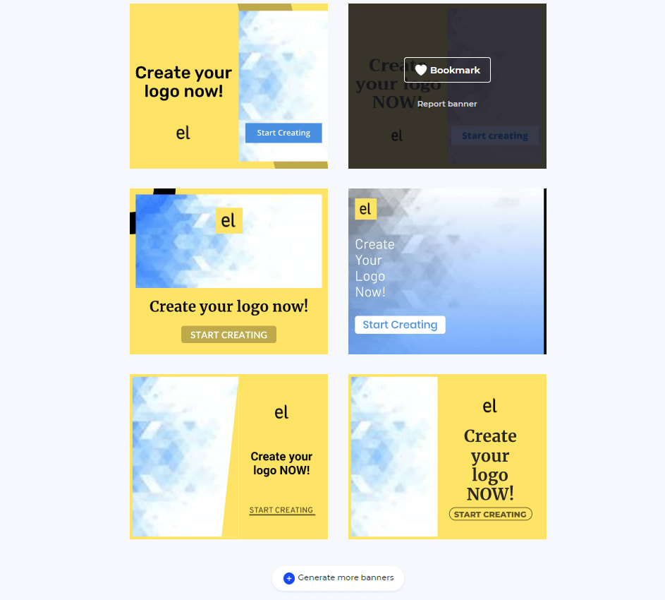
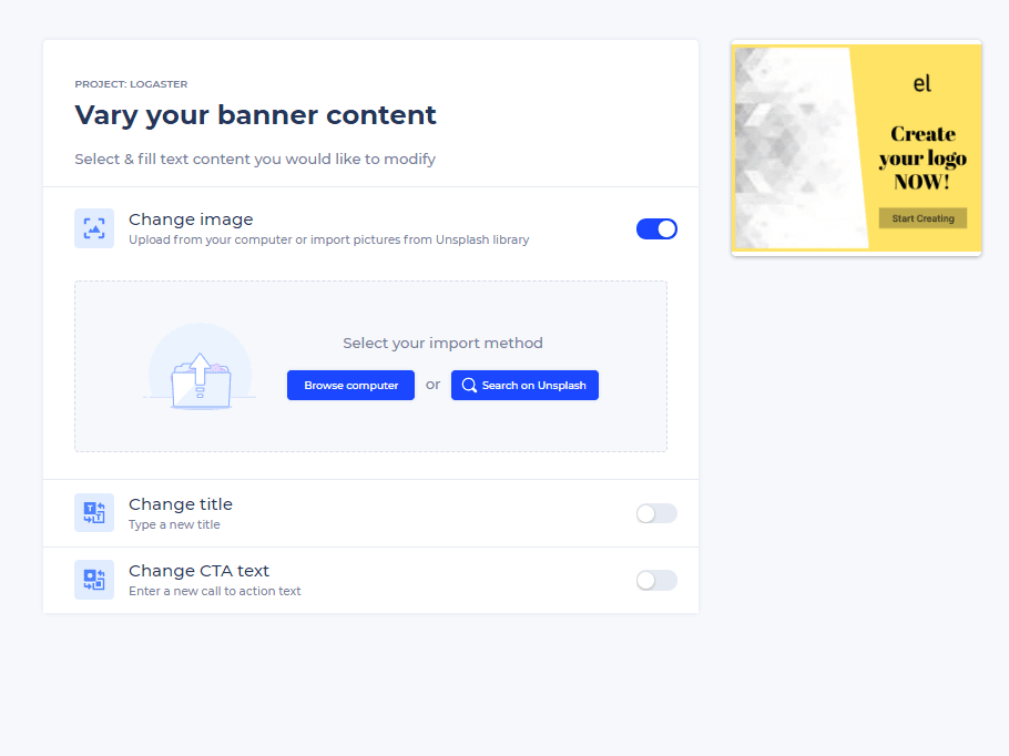
Using the content you provided, Abyssale will generate a variety of banners. Pick the best option and edit it, if needed. You can change the format, text, font, images, and CTA button. Share the finished banner with your colleagues or save it to your computer.
Teamwork
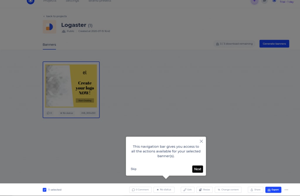
Abyssale enables your team to work on banners together. Thanks to the cloud technologies, each employee can access the Abyssale platform from anywhere in the world.
How much?
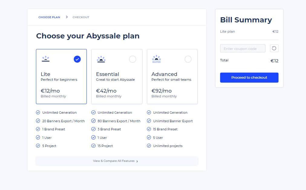
If you’re OK with limited features, you can benefit from a free plan. Paid plans with an advanced toolset start from 12 Euro a month.
Summing it up, we’d like to share one more tip with you. After creating several versions of your banner, put together a focus group to test your prototypes and gather valuable opinions. Display each banner for 3 seconds and then invite your focus group to share their impressions. Ask them whether they found the proposition clear, whether they wanted to click the CTA button, how they perceived the banner in general, etc. If the answers turn out to be mostly negative, it’s a sure sign that you need to improve the content and/or design of your banners before launching them.
