Content:
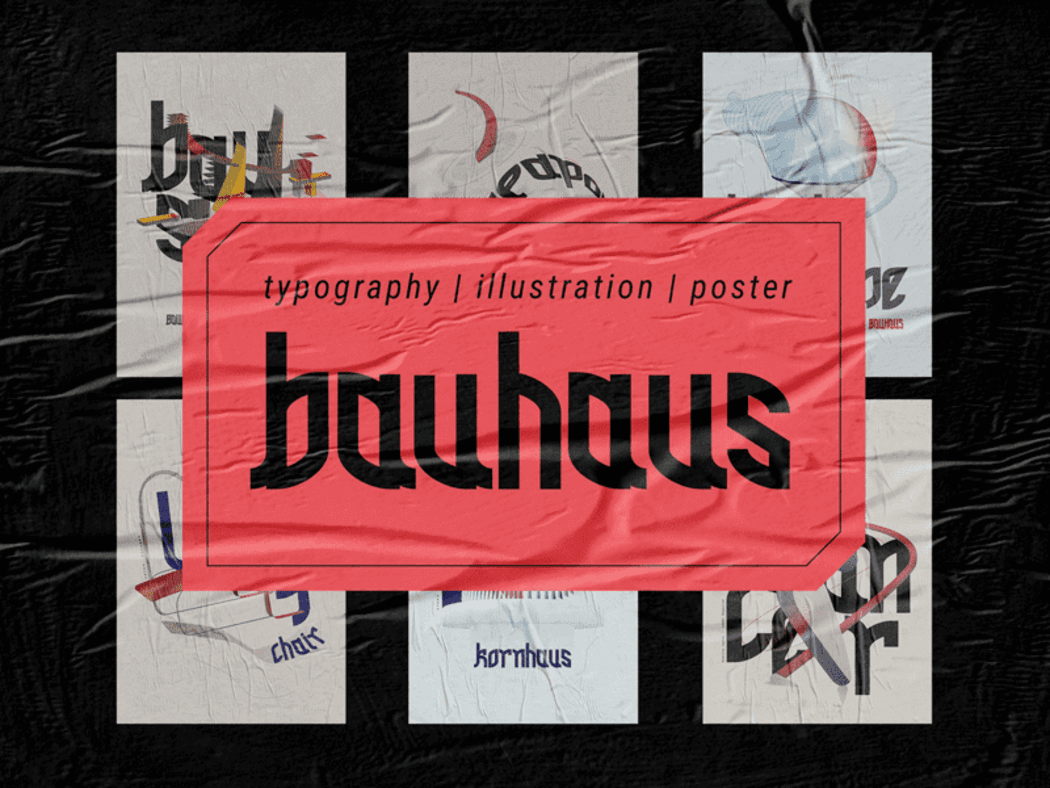
Although this year the Bauhaus style celebrates its 100th anniversary, some of its characteristics are still maintaining the foothold of major design trends. Continuously transforming and giving rise to new alternative forms, Bauhaus remains an influential artistic movement across a variety of industries, including branding. Let’s find out what makes artists and designers all over the world use Bauhaus in their creative works.
What is Bauhaus?
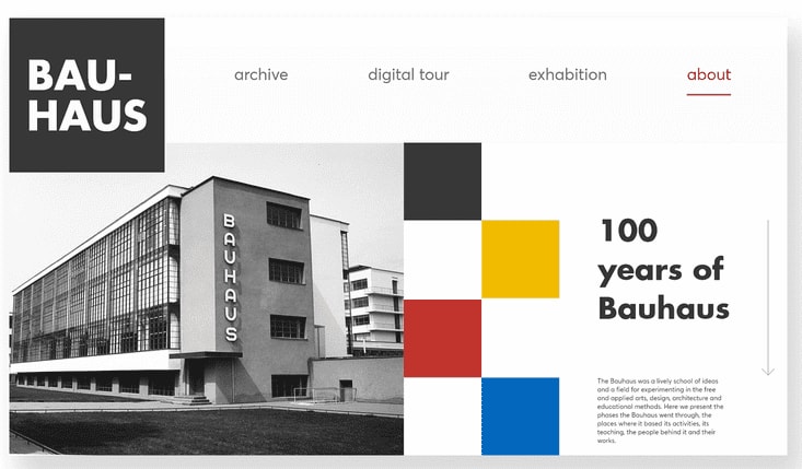
Bauhaus (literally “building house”) is a current in the modernist architecture that emerged in a German art school commonly known as the “Bauhaus.” In his 1919 work “Bauhaus Manifesto and Program”, the architect Walter Gropius outlined the principles of collaboration between artists and craftsmen. The aim was to make architecture serve to the benefit of mass production. Unlike its predecessors, Bauhaus focused on simplicity and high functionality. One can say that Bauhaus was the definition of the “Less but better” (“Weniger aber besser” in German) rule. Naturally enough, the new style was heavily criticized by those who loved luxury and sophistication. In 1932, when Germany was dominated by the Nazis, the school was closed because it was “disseminating democratic ideas.” That, however, did not stop the new philosophy from spreading globally. Bauhaus had a plethora of followers all over the world, including Le Corbusier (France), Mies van der Rohe (Germany, USA), Jacobus Oud (Netherlands), etc. Over the course of the 20th century, Bauhaus was subject to both criticism and praise. During the Nazi era in Germany, it was considered “the art of the Bolsheviks.” At the same time, the USA and the German Federal Republic praised Bauhaus as the pure essence of minimalism. In the mid 60s, Germany acknowledged Bauhaus its cultural heritage. Despite mixed opinions, the Bauhaus style managed to go beyond its architectural application and influenced all arts, including graphic design.
Source – Arthur K
Main characteristics
Like any revolutionary style, Bauhaus has its unique characteristics that made a major contribution into the architectural environment of the 20th century and continue to shape the scene even today. If you’re willing to apply this amazing style to your logo, be sure to check out the 5 main principles that make the Bauhaus fundamentals.
Form follows functionality
The dominant role of functionality adds meaning to the aesthetics of the form, instead of denying it. Ignoring useless design elements, the Bauhaus artists only trusted the most indispensable ones, experimenting with the form, arrangement, and contrast. This way, visually attractive and essential details create a simple yet engaging brand identity with a powerful idea behind it.
Source – WFlemming Illustration
Minimalism
By refusing to use excessive details, the Bauhaus advocates followed the path of minimalism. Inspired by the idea of simplicity and accessibility, the founders of Bauhaus even chose to write the name of the style with a lowercase letter, although all German nouns are capitalized. The “less is more” principle allows to combine functionality and minimalism and focus on what truly matters. In this case, minimalism serves as a powerful artistic tool.
Source – Turgay Gasimli
Revolutionary fonts
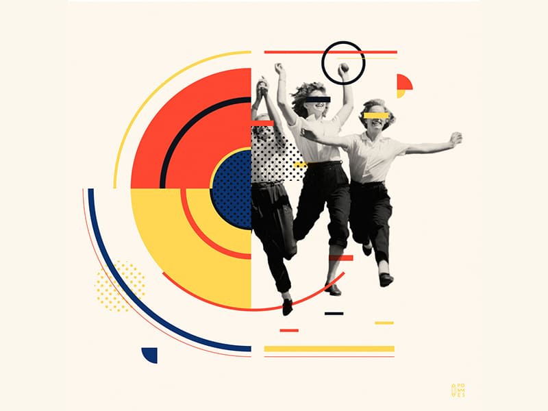
Starting from the first six letters of the Joschmi font created by Prof. Joost Schmidt in 1930, typography became another field to yield to the Bauhaus influence. In the times when Germany had an extremely strict and conservative typography rules, the Bauhaus fans decided to arrange text vertically or around the image to make it an essential part of the composition. Bauhaus enriched the existing typography with geometric fonts that lacked decorative serifs, creating its one-of-a-kind aesthetics.
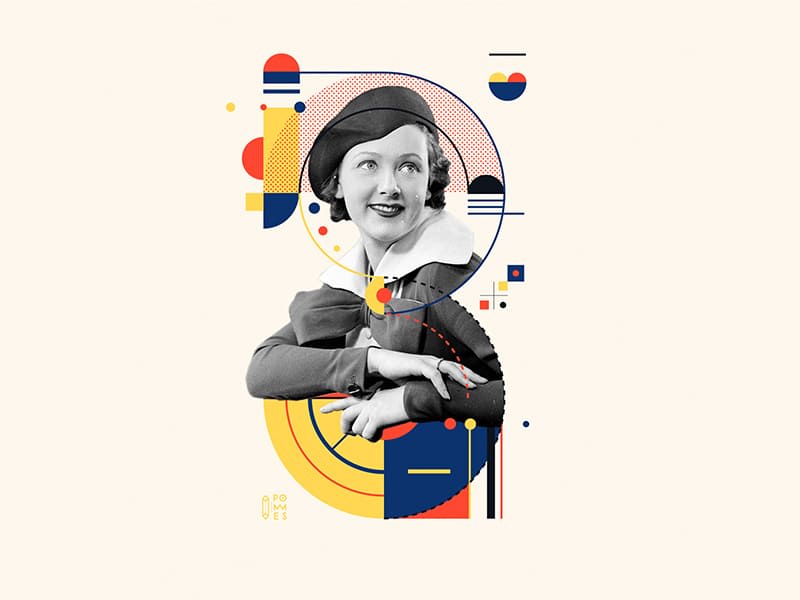
Source – Pommes
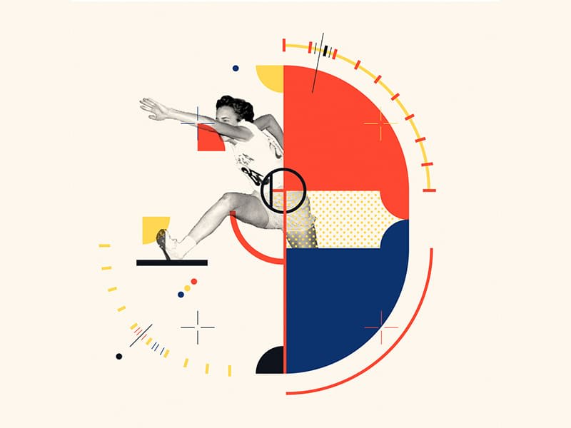
Source – Pommes
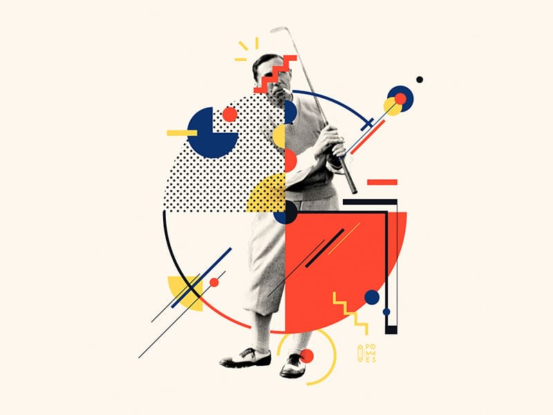
Source – Pommes

Source – Pommes
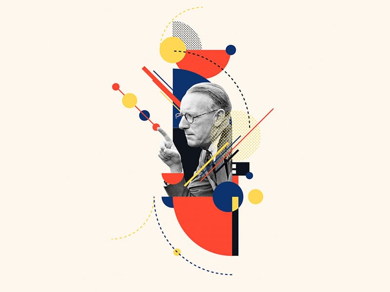
Source – Pommes
Source – Pommes
Geometry
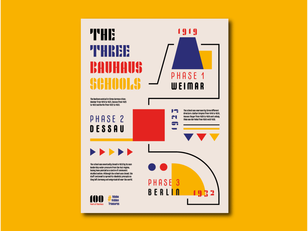
Geometric figures are a simple way for explaining the essence of many things, even the most sophisticated ones. This is why, in their strive for minimalism and rationality, the Bauhaus fans chose cubism as their main artistic method. Geometry remains an essential part of modern design solutions. Based on geometry, the 2019’s trend New Age brings Bauhaus back among the top graphic design styles.
Source – Ryan McKnight
Key colors
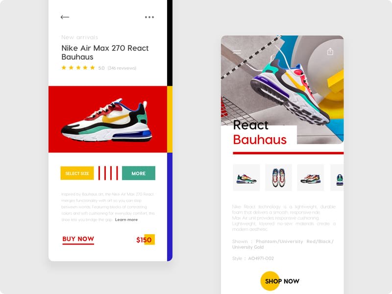
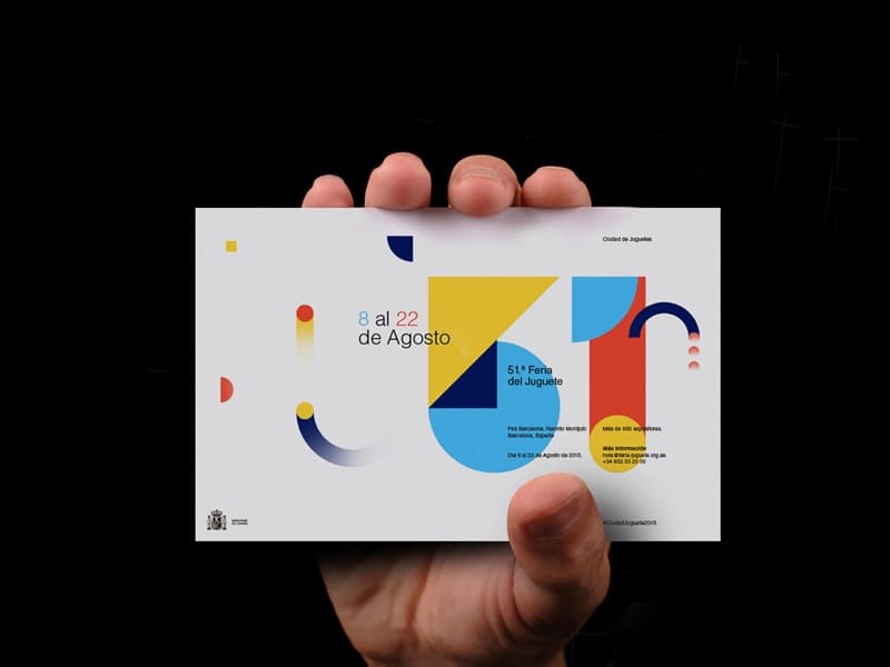
Striving for simplicity, the designers using Bauhaus mostly apply only three main hues from the color palette, which are red, blue and yellow. Plus, Bauhaus favors achromatic colors like white and black. By pairing the main colors and their contrasting shades, you can create exciting visual effects. While the modern graphics often incorporates several additional colors, this is not at all characteristic of the Bauhaus style.
Source – Mojo
Source – empatía
Bauhaus in modern branding
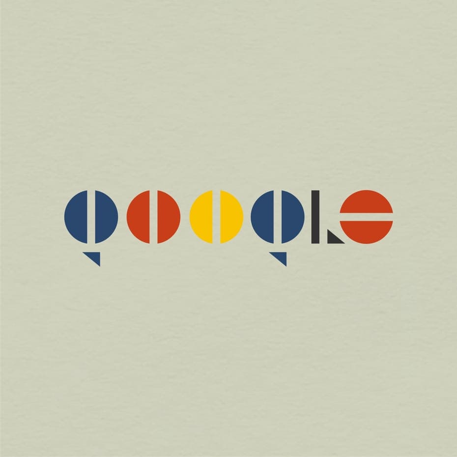
The 99designs team decided to experiment with the logos of major companies by redrawing them according to the principles of the Bauhaus style. Let’s see what they came up with!
The Bauhaus-inspired Google emblem uses the same colors as the original one. This allows us to instantly recognize the iconic logo! The company name is written in an accurate geometric font.
Source – 99designs.com
Burger King
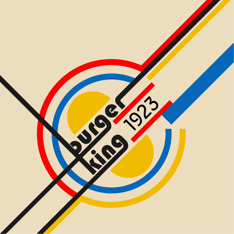
The revised Burger King emblem preserves the expressiveness of its prototype. There is a major difference, though. While, to convey emotions, the original design used smooth lines and shapes, the new logo opts for precise perpendicular lines. Another noteworthy change is a new typography.
Source – 99designs.com
Starbucks
The Starbucks emblem is easy to recognize as well. The designers added a constrasing effect by splitting the image into two – something that lacks in the original logo. Plus, we can see a completely new color palette since Starbucks’s iconic green shade is not typical for Bauhaus.

Source – 99designs.com
The original Instagram logo is another design featuring the shades which are uncharacteristic of Bauhaus. For that reason, the new emblem incorporates a totally new color scheme. Instead of rounded angles, the 99designs team used a square and equilateral triangle.

Source – 99designs.com
Lego
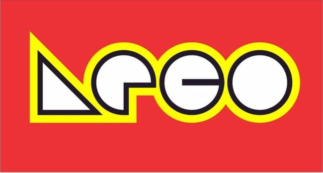
The Bauhaus fonts have a modern, futuristic look, which can be easily seen in the altered Lego emblem. Although one unmistakably recognizes the renowned logo, the new geometry of letters gives it a unique feel. Since the original color palette used the main Bauhaus shades and contrasting effects, it stayed pretty much unchanged.
Source – 99designs.com
Well, have we managed to get you hooked on Bauhaus? Are you inspired to create a highly functional logo by exploring the potential of simple graphics? If your answer is “yes”, then be sure to tap into the possibilities of the wildly powerful Bauhaus style!
