Description: In this article, we will be using “Game of Thrones” as an example to explain how to convey your brand concept and principles through colours, sigils, and words. There’s so much to learn!
Want to get inspired by strong branding ideas? Join us and learn some lessons from the creators of the iconic TV series “Game of Thrones”. Each powerful family in the series is a unique brand with its own identity. ZenBusiness’s team has analyzed the identity in depth and look at each as brands for you to use some out-of-the-box approaches to promote your business.
The Starks
Brand Name and Slogan
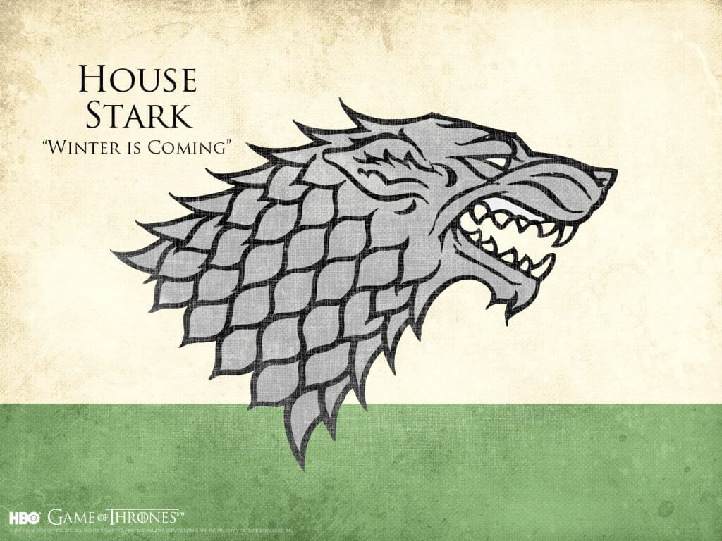
House Stark of Winterfell – “Winter Is Coming”
Hidden Meaning behind the Logo
The direwolf on the ancient family’s coat of arms is an image with several hidden meanings. Firstly, the animal lives in a cold climate, thus symbolizing the North where the Starks reign (this message is complemented by the motto “Winter Is Coming”). Secondly, wolves are strong, brave, freedom-loving, and devoted to their pack, so are the Starks to their family.
Colours and Fonts
The gray-and-white palette of the image has an austere look and is associated with winter scenery. White symbolizes purity and frankness while grey means delicacy and restraint. The achromatic palette is shaken up by a quiet green field standing for peace and the good.
The major font used in the series for each family’s branding is the elegant Trajan Pro, a font that belongs to the classic font family. Its rounded letters with delicate serifs resemble the Roman typeface.
Useful Takeaway
Create a visual metaphor for what you do best. Come up with at least 5 reasons to make your customers like you and your competitors afraid of you. Find a simple but powerful sigil to represent these values.
The Lannisters
Brand Name and Slogan
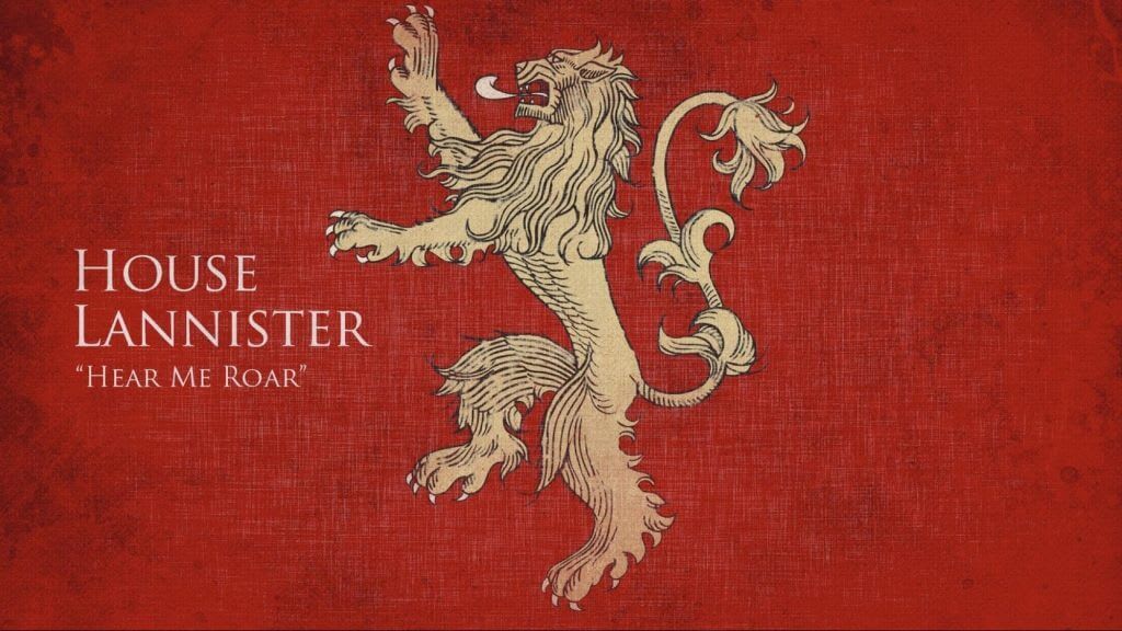
House Lannister of Casterly Rock – ”Hear Me Roar”
The family has another unofficial equivocal slogan which is “A Lannister Always Pays His Debts”. Its literal meaning is the promise to pay for their bills while the hidden message is the threat of revenge.
Hidden Meaning behind the Logo
The lion represents the power, might, and force embodied by the Lannisters. This image strikes terror on the hearts of their competitors. Lions are also known for defending their pride to the last drop of blood.
Colours
The golden and crimson tints amplify the idea of the logo. This combination is associated with royal power, success, passion, prosperity, energy, and aggression.
Useful Takeaway
The use of double meaning is one of the most effective approaches to reinforce a brand. Try to ensure that each association creates a positive image.
The Targaryens
Brand Name and Slogan
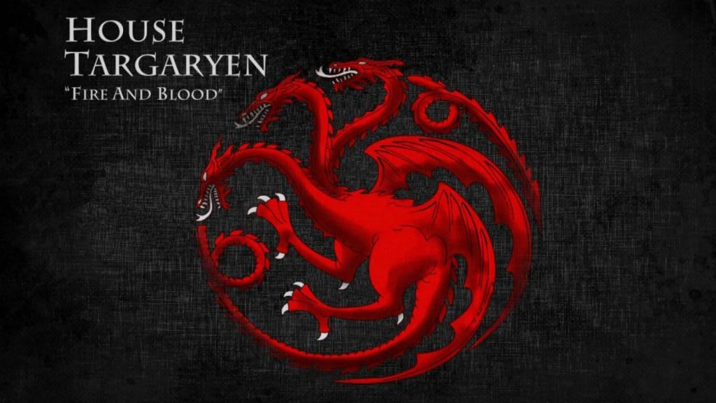
House Targaryen of King’s Landing – “Fire And Blood”
Hidden Meaning behind the Logo
The three-headed dragon against the black field is an ambiguous sigil. On one hand, the mythical animal is associated with valour and ferocity, and on the other hand, wisdom, power, and fortune. The motto suggests the family’s ruthlessness and destructive character.
Colours
The red-and-black palette looks dramatic and ominous. This combination symbolizes power, aggression, mysteriousness, and passion.
Useful Takeaway
Your logo, colour palette, and motto should work coherently as elements that convey consistent messages will reinforce the brand identity. This approach will allow your customers to quickly perceive and memorize your message.
The Tyrells
Brand Name and Slogan
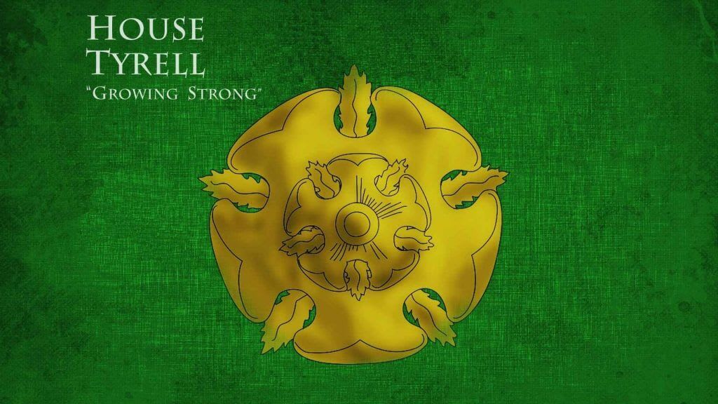
House Tyrell of Highgarden – “Growing Strong”
Hidden Meaning behind the Logo
The rose is a sigil with double meaning. The tender flower is associated with beauty, love, and tenderness, whereas its thorns symbolizes threat and the ability to take a stand for oneself.
Colours
The green-and-golden palette perfectly fits the Tyrell family’s character. Green embodies not only harmony and health, but also jealousy and greed. The golden tint alludes to royal power and prosperity.
Useful Takeaway
Using a flower as the image may be unsuitable for some brands due to its ambiguity. Be sure to study all of the associations before making your choice.
The Martells
Brand Name and Slogan
House Martell of Sunspear – “Unbowed, Unbent, Unbroken”
Hidden Meaning behind the Logo
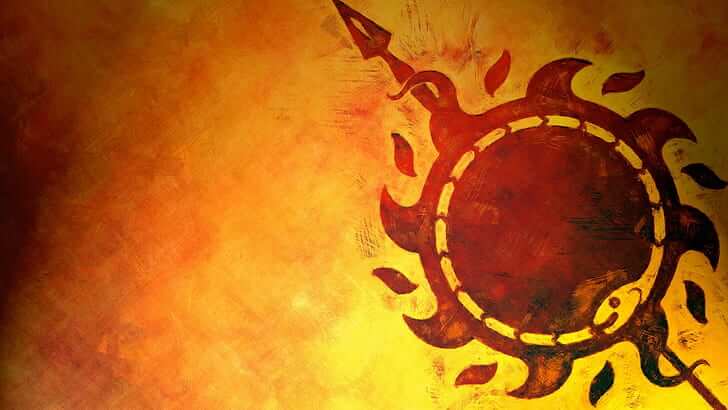
The emblem weaves together two powerful sigils at a time and demonstrates the sun pierced by the spear. Such a logo is associated with life, passion, and success on the one hand and energy, power, and bellicosity on the other. Sunspear, the name of the castle the Martells live in, embodies this image as well.
Colours
The red-and-orange palette complements the meaning of the emblem which represents passion, aggression, and vigor. Besides, these shades are associated with a warm climate (the family reigns in the South).
Useful Takeaway
Don’t limit yourself to one sigil, choose two complementary symbols for the logo. However, don’t go overboard with the details. Remember that your emblem should remain simple and comprehensible.
The Tullys
Brand Name and Slogan
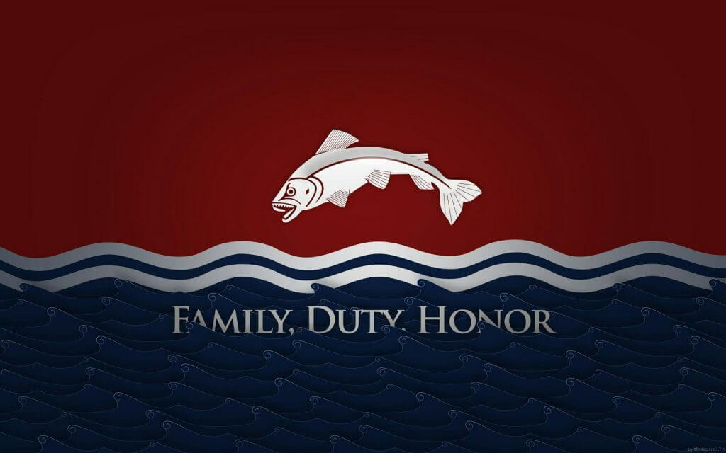
House Tully of Riverrun – “Family, Duty, Honour”
Hidden Meaning behind the Logo
It is no surprise that trout has become the visual embodiment of the Kings of Riverlands. This fish is one of the most dexterous in the undersea world. It can adapt and wriggle out of a fix.
Colours
The identity is represented by three tints. Burgundy stands for power and confidence, blue for wisdom and trust, and silver for grace and elegance.
Useful Takeaway
Don’t be afraid of simple and literate associations. Search for an image that alludes to the company’s location or name.
The Arryns
Brand Name and Slogan
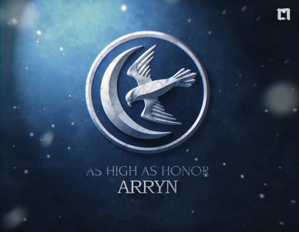
House Arryn of the Eyrie – “As High As Honor”
Hidden Meaning behind the Logo
The flying falcon symbolizes both the characters and the location. The bird is associated with power and confidence as well as the unattainable altitude where the Arryns’ castle is located at.
Colours
The blue-and-white palette was not chosen randomly. It echoes with the motto “As High As Honor”. White stands for purity and excellence, and white represents the sky.
Useful Takeaway
The combination of powerful sigils and minimalism is a win-win formula of a strong brand identity. Be sure to consider this approach when designing your own logo.
The Greyjoys
Brand Name and Slogan
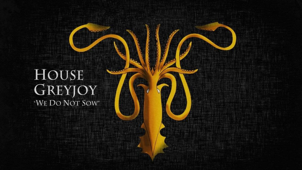
House Greyjoy of Pyke – “We Do Not Sow”
Hidden Meaning behind the Logo
The emblem of the Greyjoys ruling over the Iron Islands is represented by an illustrated kraken, a mythical creature. Kraken is often described as a giant octopus. With its invincible powers in the sea, it is believed to have the strength to easily conquer ships. Such an emblem is associated with unpredictability, danger, and flexibility.
Colours
The black background of the logo evokes the atmosphere of mystery, and the golden kraken stands for power and prosperity.
Useful Takeaway
You don’t have to use real-life sigils, you can get inspired by myths and legends. You should be careful though as many mythical creatures can trigger negative associations.
The Baratheons
Brand Name and Slogan
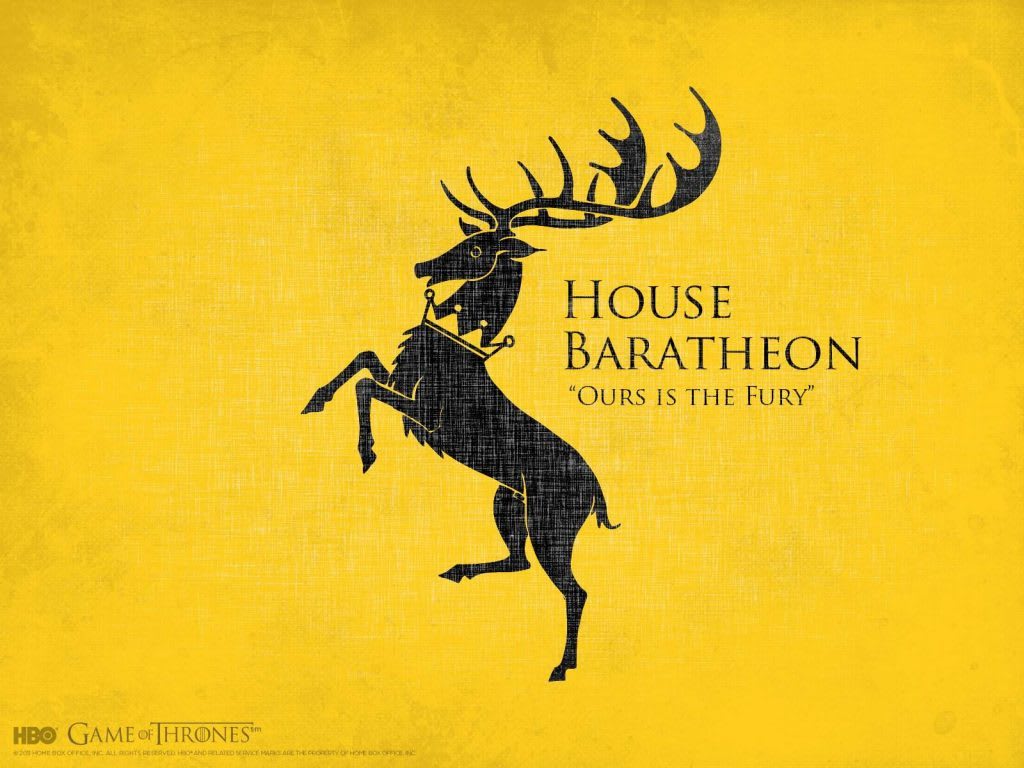
House Baratheon of Storm’s End – “Ours Is The Fury”
Hidden Meaning behind the Logo
The crowned stag is a complicated and universal image referring to status, power, patronage, and courage. The branching horns contribute to the impression: the bigger they are, the better the animal’s living environment is. Besides, the horns symbolize revival since stags regularly renew their horns.
Colours
The black-and-golden palette alludes to royal power, prestige, wealth, and success.
Useful Takeaway
Try choosing a unique sigil with multiple meanings and complement it with proper colour schemes that promote the brand’s core idea.
Conclusion
Branding inspirations can be drawn from both real life and the world of art. You shouldn’t copy any brand’s identity as it is. Instead, choose an image that’s relevant to your business, dive deep into it and use these approaches to reinforce your brand identity.
