- What is a pattern and how is it different from iteration and rhythm?
- How do you use patterns in web design?
- Basic Elements Used in Patterns
- How to Create a Pattern on Your Own
To create a nice pattern for your company, you need the master the basics of web design. We bet your first idea would be to hire a professional designer or design studio. But don’t be too hasty! Do you really need external help? Are you sure you can’t create a decent pattern yourself?
This article will help you draw an eye-pleasing pattern for your site. Let’s start with the basic information about patterns and work from there.
What is a pattern and how is it different from iteration and rhythm?
Although pattern, iteration, and rhythm are all different things, they are often confused with each other. Patterns use iterations and rhythms as tools for achieving the desired visual effect. Let’s draw a distinction between these three terms.
Iteration
Iterations are very common in web design. When using an iteration, you’re attracting customer attention with two similar images that still have some differences. Life shows that users enjoy scrutinizing such images! Iterations are used in two cases:
Iterations on a background image. It’s a designer technique that relies on matching graphic elements. Despite visual similarity, each element has its unique characteristics. Think about a staircase. Each stair is an individual object although it looks like other stairs. Individual elements can vary by color, size, and even form, while having one or more common characteristics. This is a secret to creating a balanced web design.
Iterations in content location. You can identify a permanent location for important elements on your web page. This way, you’ll enhance user experience big time. By placing a logo, button or any other content in the same spot across all web pages, you’ll make it easier for the user to memorize your page structure and automate their actions on your website.
Rhythm
When talking about music and sounds, most of us understand what a rhythm is. But what about a visual rhythm? Visual rhythm is achieved through arranging elements at intervals. In design, there are 5 main types of rhythm:
1. Random rhythm. Elements are arranged in a chaotic yet balanced way. Random rhythm is a good way to freshen up your web design. Be careful as not to sabotage the accessibility of other types of your content.
2. Regular rhythm. Elements are arranged at equal distances from each other. For the human eye, this type of rhythm is the easiest to perceive. To breathe a life into your web page, apply a few colorful highlights.
3. Alternating rhythm follows the 1-2-1-2-1-2 sequence, where the distances between 1-2 and 2-1 are different. Use an alternating rhythm to spice up a monochromatic design.
4. Smooth rhythm. Elements are arranged in the form of a wave, creating obvious associations with nature (river flowing, wind blowing, etc.). Smooth rhythm tends to relax and calm down, so make sure this type of rhythm still motivates the user to do a certain action.
5. Progressive rhythm. The distance between elements is increased and decreased progressively. It’s a great way to build up visual dynamics and movement. This type of rhythm works extremely well for objects of varying sizes. To enhance the effect, play with shades and lightning.
Pattern
Unlike iterations, a pattern uses identical elements arranged in a strict order. Compared to a rhythm, a pattern is a wider term that relies on different types of intervals. Let’s take a look at the key patterns:
1. Symmetrical pattern is based on reflection symmetry. The symmetry level can vary from basic to intricate.
2. Asymmetrical pattern. Elements are arranged in a chaotic, random way. Despite the visible asymmetry, elements must craft a balanced composition driven by the same idea.
3. Spiral. Elements are arranged in the form of a whirlpool, creating a near-hypnotic effect. A spiral is associated with growth and continuous development.
4. Grid. Square- or diamond-shaped figures overlap with each other. The grid creates a logical geometric pattern that draws user attention like a magnet.
5. Centralized pattern. The central part of the pattern is highlighted, while the edges stay faded. Use this pattern to guide user attention to the right spot on your page.
6. Linear pattern. Draw a line along the information you want to highlight. This is another way to bring the most important content to the attention of your visitors.
7. Radial pattern. Elements are arranged in the form of a circle or oval. Unlike the spiral pattern, elements don’t form into a spiral but spread out from the center, like flower petals.
8. Cluster. Elements are divided into groups, with each group forming one big part of the pattern. Multiple clusters contribute to the overall image.
9. Fractal. Small elements are connected with each other in the same way to create a bigger element. Links in a chain are a great example of a fractal pattern.
How do you use patterns in web design?
Patterns can have multiple applications you might have never thought about. Let’s break down how an entrepreneur can use patterns to enhance their brand.
Web design
Patterns are extremely popular in web design, and for a reason. First, they’re easy to create with the help of online services and graphic editing tools. Second, patterns make a web page look more orderly and logical. Now that you know how diverse patterns can be, you can play around with different options until you find the right pattern for your website. To set off the monotonous effect of patterns and make your web design more lively, try using animations.
Brand identity
Want to get yourself a logo with an abstract pattern? On the ZenBusiness website, you’ll find a huge collection of icons and patterns. You’re sure to find the options that fit your brand personality!
When crafting a visual style for your brand, pick the pattern that reflects the essence of your brand and communicates the right message to your audience.
Clothing
T-shirts, baseball caps, hoodies, and aprons are all ideal surfaces for your corporate pattern. The only problem is that it’s hard to find the tissue that would resemble your unique pattern. Most likely, you’ll have to print your pattern onto your clothing items. It’s a very responsible task, so be sure to pick a reliable print shop and discuss all the details beforehand. If you do everything right, you’ll end up with a custom uniform for your employees and nice gifts for your loyal clientele.
Interior design
If your brand identity includes a pattern, why not use it in your office, studio or shop? You can either paint your pattern on the surface or apply stickers – the choice is yours! By putting your pattern on the walls, floor, mirrors, or furniture, you’ll create a truly unique atmosphere. It’s a great way to boost team spirit and increase performance among your employees. As for customers, they’ll appreciate how much thought you’re putting into your interior design!
Packaging and labels
Scratching your head over how to attract customers to your merchandise on a supermarket shelf? Using the marketing potential of your product’s packaging and label is a way to go. An iterative pattern will make your product stand out among its competitors and stir up customer curiosity. Experiment with shapes, sizes, colors, and visual effects. Remember that even the tiniest detail can tip the scale towards a purchase!
Presentations
In presentations and infographics, a pattern plays the role of a guide. Use patterns to prioritize important information, retain viewer attention, diversify your report, or simply decorate it! Create a simple, unobtrusive background that will be able to break monotony of a white sheet.
Basic Elements Used in Patterns
While you can base off your pattern of any icon, most web designers rely on geometry for creating effective and memorable patterns. Let’s find out what emotional effect major geometric shapes can have on the audience.
Quadrangles
Squares, rectangles, and diamonds are associated with order, logic, and rationality. If you want to show how organized and solid your business is, you can’t go wrong with quadrangles.
Circles and ovals
A circle, oval, and ellipsis make you think of reliable teammates that are always ready to help each other. Such warm associations are created by smooth, soft lines. Rounded shapes are the best way to make your clients feel secure and win their confidence.
Triangles
Use triangles to convey the idea of growth, movement, and dynamics. A background image with triangles will motivate your visitors to move forward and achieve better results (with your help, of course!).
Lines
Straight lines look minimalist and concise. In the world overwhelmed with visual information, simple lines can have an almost therapeutic effect on the viewer. While vertical lines inspire and stir up interest, horizontal ones calm down and relax.
How to Create a Pattern on Your Own
Online pattern generators
Online generators are the easiest way to compose a pattern. You can choose a ready-to-use template and customize it to fit your brand personality. Let’s make a quick overview of the best online generators.
Patternizer
Patternizer uses layered stripes for creating a good-looking pattern in a few minutes. You can modify the color, offset, width, opacity, and other parameters of your pattern.
GeoPattern
If you’re intimidated by the very words “graphic design”, we have a shortcut for you. Go to GeoPattern, pick a template and type in the text you want to see on your pattern. The smart service will transform your letters into a neat image.
Patterncooler
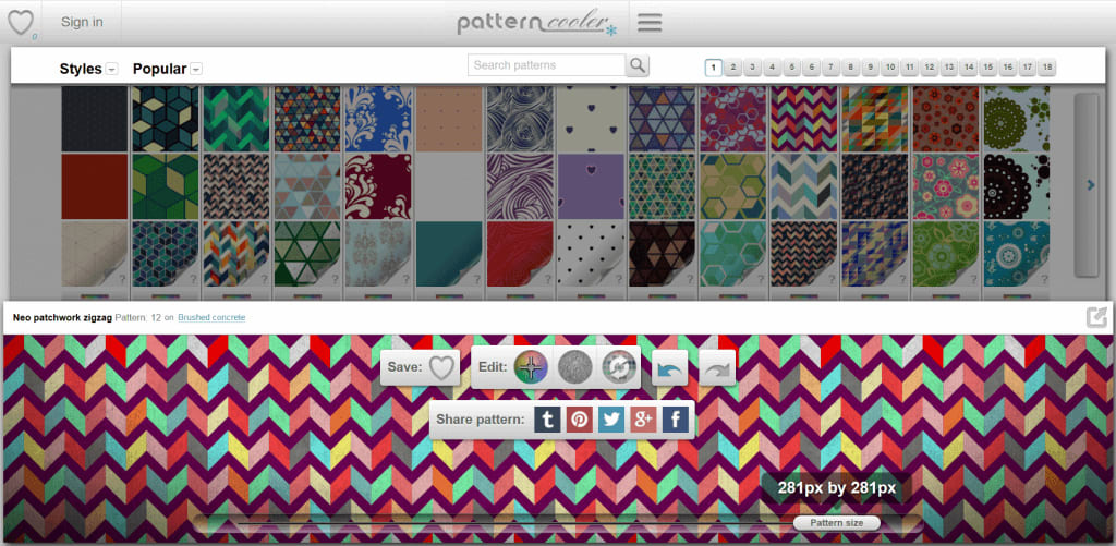
Here is another free pattern generator with an intuitive interface. But most of all, Patterncooler is proud of its stunning collection of templates that exploits various visual themes. Feel free to pick any template and edit its texture, colors, overlapping, etc. till you’re happy with the result.
Background Image Generator
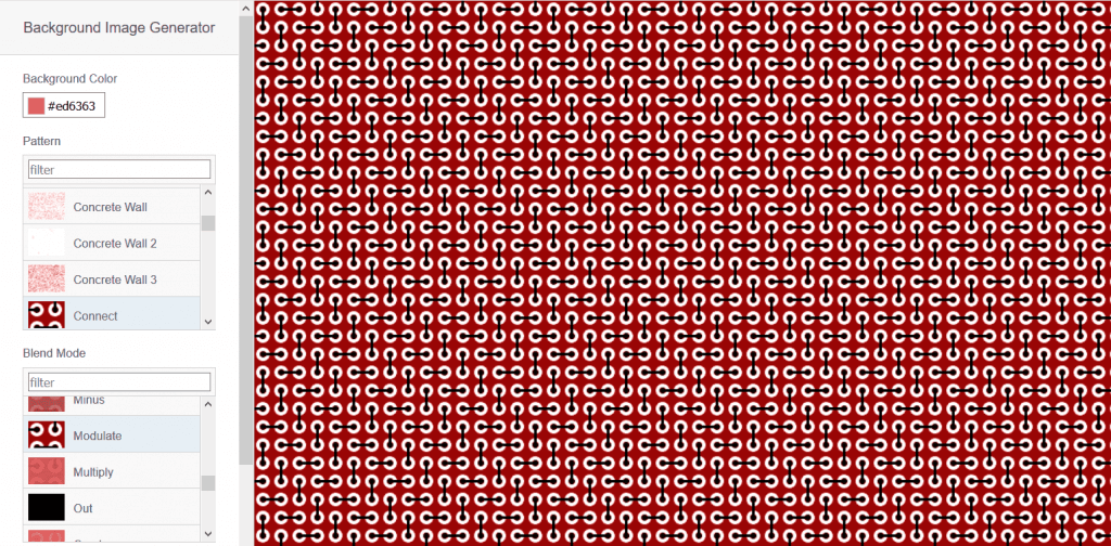
The service will guide you through several simple steps. First, choose the main color and image. Second, set up intensity, noise, and other effects. The system will generate a simple background image that will enhance your corporate website.
Striped Backgrounds
Minimalist designs end up having the biggest psychological impact on the audience. Look at how the Striped Backgrounds service creates a five-color pattern by using nothing but vertical lines!
Graphic editing programs
To use graphic editing programs, you’ll most likely need some skills working with graphics. But don’t give up this idea just yet! Since patterns are rather simple images, you might actually be able to craft one even without experience.
Adobe Illustrator CS6 (and higher)
Adobe Illustrator is an iconic graphic editor for consummate designers. It boasts a stunning functionality that can scare off an amateur like you. But don’t worry! Follow our step-by-step instruction and you’ll be fine!
Step 1
- To create a pattern from scratch, do this:
Open a new canvas and select a graphic object that will be the core element of your pattern. Click “Object” > “Pattern” > “Create”.
- To edit a ready-to-use pattern, do this:
Go to “Samples” and double click the pattern you need. Then click “Object” > “Pattern” > “Edit Pattern”.
Step 2
In the “Pattern Parameters” window, you can edit your pattern name or set a new one.
Step 3
Also, you can make the following settings:
- select the type of an element;
- set the height and width of an element;
- add overlapping and other effects;
- set the number of elements;
- adjust opacity;
- arrange elements into a frame;
- etc.
Step 4
Save your pattern in the “Samples” palette or cancel the changes.
Adobe Photoshop
When opening Adobe Photoshop, get ready for a confusing variety of icons and features. Luckily, you won’t need them all to compose a pretty pattern! Check out our brief instruction below.
Step 1
Open a new canvas (8px x 8px) and create an original image.
Step 2
To define the image as a pattern, click: “Edit” > “Define as pattern”. At this step, you can also set a new name for your pattern.
Step 3
To test the new pattern, open a new canvas. Fill the pattern by clicking: “Edit” > “Fill”. From the “Pattern” drop-down list, select your newly created pattern. The pattern will fill the entire canvas. All you’re left to do is to select a balanced color palette.
CorelDraw
Corel Draw is another graphic editing program that will give you a hand in creating both simple and compound patterns for your website. Watch this video lesson to master CorelDraw hassle free!
Your corporate pattern – like your fingerprints – must be one-of-a-kind. For your pattern, pick the images and colors that characterize your business and bring out its strong sides. If you’re feeling lost, don’t be too hasty to hire designers! Take advantage of clever pattern makers and graphic editors to put help you with your design.
