The researchers have found that the logo shape is enough to influence brand perception. Geometry can tell customers about the company’s values, products, and advantages. Let’s find out how to design your logo properly to attract customers. In this article, we’ll analyze the psychological background of various shapes and tell you how well-known brands use them.
Circle
This form is used in about 20% of popular logos and symbolizes kindness, softness, unity, and stability. This is proven by the results of the research conducted by the INSEAD business school. The survey participants were shown ads for sports shoes and a sofa in three variations: with a round logo, an angular one, and without it. People considered the goods with a circle-shaped identity as comfortable, and with an angular one – as durable.
The circle is so versatile that it is used as a symbol of various companies including non-profit organizations, retailers, restaurants, finance companies, and many others. That’s what circles on the famous logos symbolize:
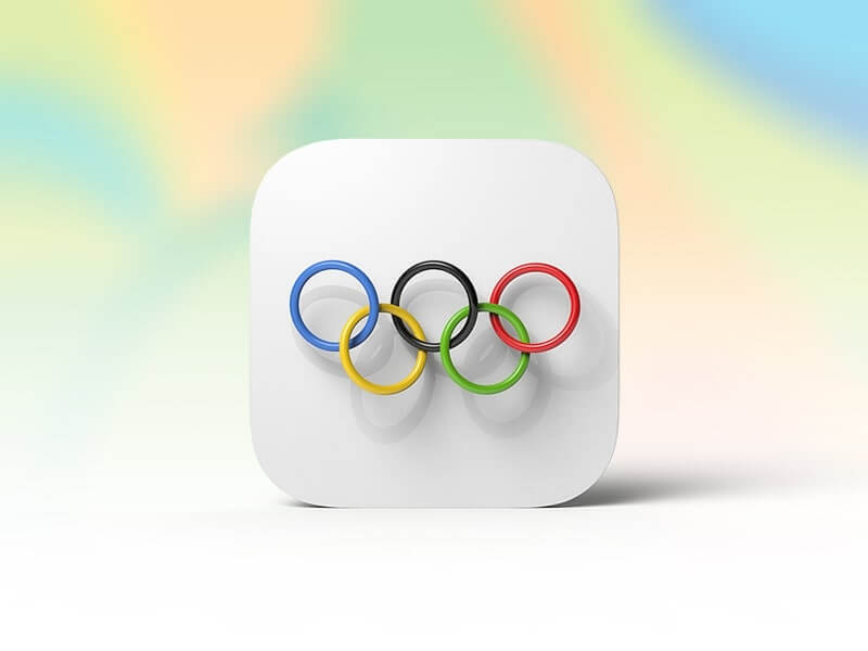
- the Olympic rings: cooperation and inclusiveness;
- NASA: the space environment, i.e. the stability and unity of the planet in space exploration;

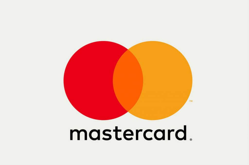
- MasterCard: a red circle means energy and vitality, and a yellow one happiness and prosperity;
- Mozilla Firefox: a red panda “hugs” the Earth and that means the browser’s worldwide coverage;
- Target: a target is a direct association with the supermarket chain’s name;
- BMW: the rotating propellers (the company started with the production of aircraft engines).
Triangle
Triangular structures are considered the most stable and safe. This form is often associated with strength, energy, inspiration, transformation, and dynamics. However, due to variations in the combination of angles and position of the figure in space, this form can be perceived differently. For example, angles directed upwards or rightwards symbolize moving forward, and downwards or leftwards passivity.
Most often, triangles are used by innovative, courageous, energetic companies focused on the male or youth audience (for building, automotive, legal, and science industries). Let’s analyze the symbolism of these well-known brands:
- Delta Airlines: an airplane wing;
- Google Play: a play symbol;

- Adidas: a mountain, i.e. overcoming difficulties and achieving goals;
- Doritos: a triangle crisp — the basic product of the company that positions itself as dynamic, courageous, and inspiring.
- FedEx: a triangle as a part of the arrow in the negative space between the letters “E” and “X”; this symbolizes speed and reliability.
Square and Rectangular
These figures are usually perceived as symbols of order, confidence, and stability. The reason is that quadrilateral shapes with straight lines and corners are reminiscent of structures related to safety and security (houses, safes, bricks, and fences).
This design is suitable for brands that need to look serious and professional, such as banks, insurance companies, or law firms. But they are also actively used in other areas, such as:
- Microsoft: the four squares stand for the key company products (Windows, Xbox, Bing, and Office);
- LEGO: the branded building blocks (in this case the feeling of safety is especially important as the product is designed for children);
- Domino’s: pizza boxes;
- YouTube: an old TV screen.
Vertical and Horizontal Lines
Lines as well as rectangles convey the idea of reliability and professionalism. Besides, they can symbolize movement and dynamics. However, depending on the direction, these elements convey the brand’s character in different ways. In addition, the shape that lines form (such as a circle, a square, or an abstraction) is important.
- Vertical lines are associated with strength and sophistication as in the SoundCloud logo where the lines make up a soundtrack. This solution makes the logo of the music service look dynamic and harmonious.

- Horizontal lines create a feeling of peace and protection. For example, the logo of AT&T, the world’s largest telecommunications company made of blue stripes signifies the interconnectedness of communications that have entangled the entire globe. The circle forms the association with unity.
- Intersecting lines are a less common variation. They symbolize integration and cooperation. On the Bank of America logo, horizontal and vertical stripes form the American flag. The square shape of the logo promotes the message of reliability and professionalism of the bank.
Curves
Curved lines are a great way to renew your logo by adding dynamics to it. This type of graphics can be embodied in abstractions and recognizable symbols.
Curves allow you to effectively convey the uniqueness of the company, so they are suitable for brands that focus on maximum customer proximity. But please note that creating such logos is difficult: you need to understand exactly what you want to convey to users. Let’s look at how some famous brands did it:
- Coca-Cola и Disney: the curved lines in unique fonts to convey joy, energy, and creativity;
- McDonald’s: the golden arches are part of the company’s history (they framed the first snack bars and attracted car drivers);
- Amazon: the curved arrow between the letters “A” and “Z” symbolizes both a smile (i.e. the company’s friendly nature) and a variety of products (the store has everything from the first to the last letter of the alphabet);
- Nike: the legendary “swoosh” is associated with the wing of the goddess Nicky, that is, with the desire to win;
- Twitter: the bird symbolizes the name of the social network, as well as freedom and the speed of message delivery.
Spiral
This form is rarely used in brand identity. It symbolizes recurrence, rebirth, and infinity. Brands related to art, innovation, and medicine can meet such principles. Spirals make logos more interesting and help to attract users’ attention, as in the following examples:
- Spiral Health&Fitness: the logo perfectly reflects the company’s name – a heart in the shape of a spiral;
- Ubisoft: a spiral inscribed in a circle means a gateway to new worlds, as well as enthusiasm and curiosity.

Summary
You can use the shape of the logo to influence the psychological perception of the brand. But keep in mind that all the elements of your identity (colors, fonts, and geometry) must convey the same message, otherwise you won’t be able to achieve your goal.
Use the ZenBusiness Logo Generator to create such as a logo. ZenBusiness’s database contains thousands of icons, fonts, and graphics created by professional designers. You can be sure that all the elements will match each other and the logo will look harmonious.
