- Why Do You Need Booklets and Where To Use Them
- Choosing Booklet Type and Size
- What to Consider When Designing a Booklet
- How to Create a Booklet
- What Do You Need to Know About Preparing a File for Printing
A study by the American Bentley University has shown that even in the digital age, people value printable materials that can be touched by hands. This includes a booklet, the advantages of which include the low cost of creation and its versatile use to promote business. In the article, we will tell you how to develop and distribute a booklet.
Why Do You Need Booklets and Where To Use Them
Let’s start with the terminology. A booklet is a folded sheet of paper that contains information about a company, goods, services, or events and is distributed for promotional purposes. It is often confused with a brochure, so it is important to understand the difference between the terms. A brochure is a publication of 5 to 48 pages that are bound together in any way. In this article, we will only talk about booklets.
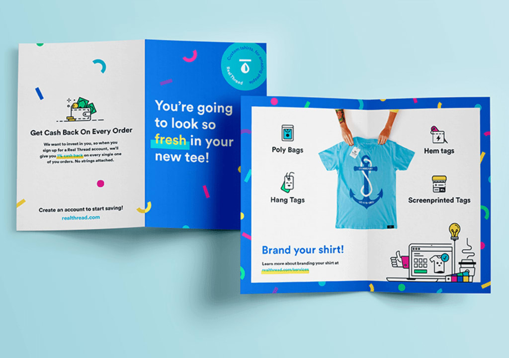
Do you think printable marketing materials are no longer relevant in the digital world? Specialists won’t agree with you.
“The decline in print advertising predicted by marketers has been exaggerated. Even in the digital age, people still value tangible modern print materials such as booklets, maps, and travel guides,” says Ian Cross, Director of Bentley University’s Centre for Marketing Technology (CMT). Under his leadership, a study was conducted on the popularity of booklets in the tourism industry.
This is what the results showed:
- Advertising printed materials are the second most popular source of information for those who plan trips;
- 85% of the respondents found out a profitable offer or business in the booklet;
- 61% of people planned to buy tickets or goods described in the booklet;
- 73% considered changing their plans because of the booklet.
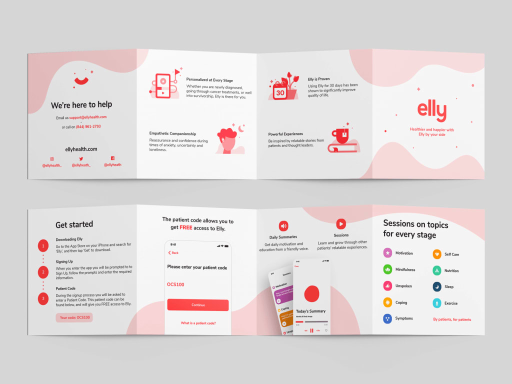
The booklets are used not only in tourism but in all other spheres from entertainment to insurance. They can be distributed wherever there is physical contact with customers, for example:
- included in packages or parcels with goods: it’s relevant for offline or online shop owners;
- put at the reception: it will suit those to whom clients come to the office (travel agencies, banks, beauty salons, etc.);
- disseminated at exhibitions: they can be presented to visitors to tell more about your products;
- placed in malls or amusement parks: make sure that your target audience is there.
Choosing Booklet Type and Size
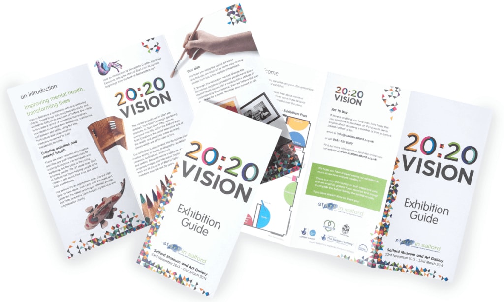
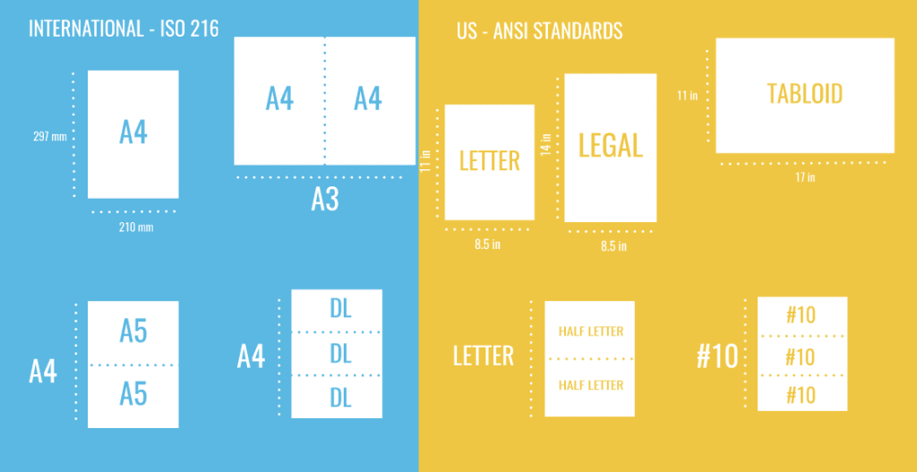
Before starting to design a booklet, decide on the size and fold type of the sheet.
Standard Booklet Sizes
| Name | Size |
| International | |
| A3 | 29,7 x 42 cm |
| A4 | 21 x 29,7 cm |
| A5 | 14,8 x 21 cm |
| DL | 11 x 22 cm |
| North America | |
| Letter | 27,94 x 21,59 cm |
| Legal | 21,59 x 35,56 cm |
| Half Letter | 21,59 x 13,97 cm |
| Tabloid | 27,94 x 43,18 cm |
Basic Fold Types
| Name | Description |
| Half-fold | The sheet is folded in half |
| Tri-fold | Three parts of the sheet overlap, with the middle part remaining at the bottom |
| Z-fold | Three parts of the sheet are folded to form a zigzag |
| Accordion fold | A method similar to the previous one but instead of three parts the sheet is divided into four |
| Gatefold | The two outermost parts of the sheet are folded inwards to form a sort of gate |
| Double gatefold | A complicated version of the usual “gate” using eight parts of the sheet |
| French fold | The sheet is bent first horizontally and then vertically |
| Sixteen-panel fold | The sheet is divided into 16 parts |
To choose the size and type of fold, answer the following questions:
- Where users will see the booklet?
- Will they have time to study it?
- How much information do you want to place in it?
- Is this information consecutive (a step-by-step guide) or random (information on products)?
What to Consider When Designing a Booklet
How do I start the design? What kind of text should I write? Where can I get photos? We have formulated a few simple rules with all the necessary information.
Rule #1. Analyze Your Target Audience
The design doesn’t start with the selection of visual elements, but with a thorough analysis of the target audience. After all, you create advertising for them. The analysis includes physical (age, gender, place of residence, social status, occupation) and psychological (interests, hobbies, desires, values, limiting beliefs) characteristics. You should select colors, fonts, illustrations, and write a text based on these characteristics.
Rule #2. Define the Message and Tone
To do this, decide on the task advertising will solve. What should your audience do after reading the booklet: come to the shop, use a discount coupon, or take part in an event?
When you answer this question, formulate the message and ensure it is readable. If you report discounts then don’t describe the company’s history. Focus on the specific products you want to sell instead. If you call for participation in crowdfunding then emphasize the uniqueness and mission of the project you are raising money for.
The tone of the message depends on the target audience. When advertising a language school for children a friendly tone and bright images will be appropriate while advertising legal services will require a more official style without humor or flirting with clients.
Rule #3. Don’t Overuse the Descriptions
A booklet is not a book: people read advertising materials quickly, so the information should be concise and well-structured. To convey the message you need to:
- Write a strong header. Its task is to attract attention and make it clear why people should read the booklet, e.g.: “Bring a friend and get a 20% discount”, “Free tasting for cheese lovers”, “Five reasons to go on a cruise”. Here are some examples of poor headers: “Our company is 20” (it’s not clear what benefits you get from reading it) or “Movement is life” (a cliché with no information).
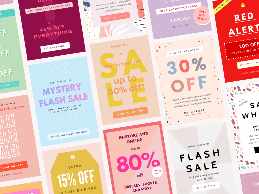
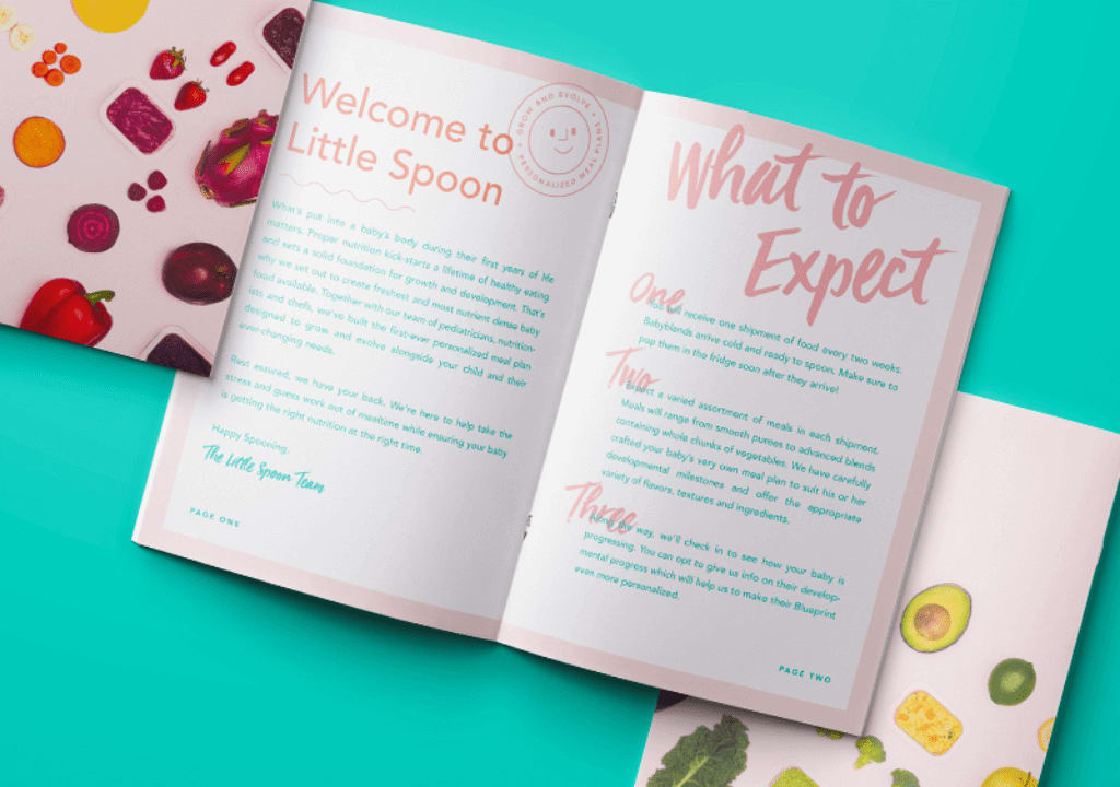
- Think of subheadings to break the text into semantic blocks and help readers navigate quickly. The text blocks should be short and the font easy to read.
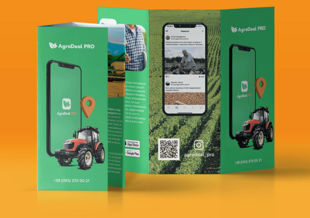
- Include contact information: phone numbers, website, social media profiles, e-mail. You can encrypt them in the QR code to track ad conversion.
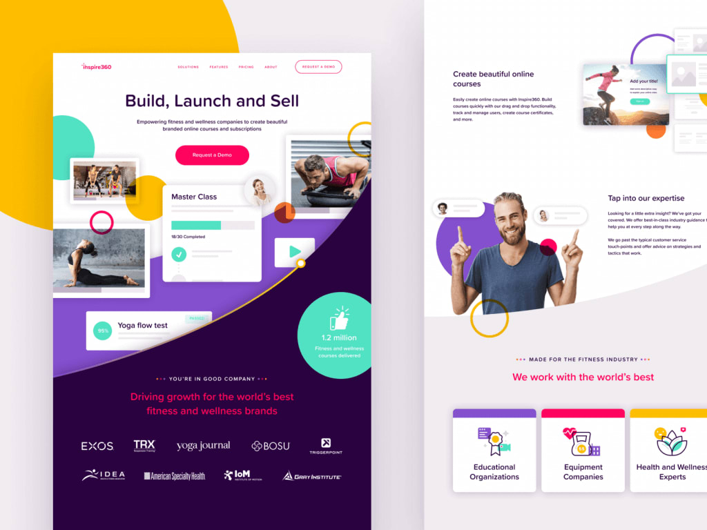
Rule #4. Use High-Quality Images
Photos or illustrations should broadcast the main message on an equal basis with the text. To do this:
- Choose high-quality images that enhance the text and provide the emotional impact you need.
- Avoid faceless stock pictures: use a photo from the company’s archive or organize a photo session.
- Don’t use too many images: a lot doesn’t mean quality. It’s better to have one big bright photo than ten small ones you can’t see anything in.
Rule #5. Formulate the CTA
Remember the task of the booklet? It’s high time to briefly formulate it in the CTA (“call to action”) to explain what clients should do after reading it.
- The CTA should be short and clear, e.g.: “Get a discount”, “Participate in a prank”, “Come to the concert”.
- Place the CTA in a prominent place and highlight it with color. For example, a good idea is to place large red blocks in each part of the booklet. Tiny black inscriptions on the last page of the booklet is a bad option.
Rule #6. Remember to Brand the Booklet
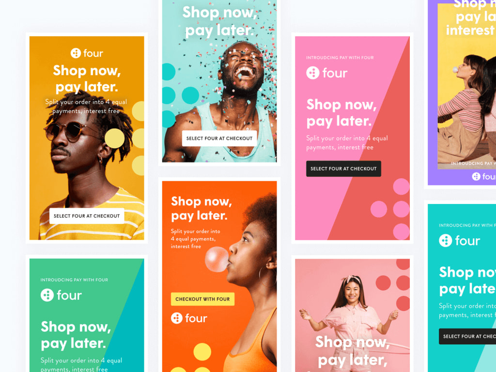
The booklet is as much a part of the brand identity as your website or business cards and therefore should complement the image of the brand.
Use corporate colors, fonts, and logos to be remembered and recognized. If you have no identity yet, ZenBusiness’s online service can help you develop it. Here you can develop your logo, choose colors and fonts in just a few clicks to create a visual brand image.
Rule #7. Stick to Minimalism
Advertising is not a chance to show the best at once. Avoid scads of photos, graphics, and text.The simple and neat design delivers the message much more effectively than dozens of elements that compete for readers’ attention.

How to Create a Booklet
There are three main ways to develop printed advertising materials.
- Independently. Suitable for those who are good at working with graphic editors such as Photoshop, Illustrator, InDesign. This method requires time and effort but saves budget.
- Hire a Designer. If you have enough money you can hire a freelance designer on online exchanges (Upwork, Fiverr, or others). Explore the designer’s portfolio and previous customer feedback.
- Use templates. Online services such as Canva or Adobe Spark offer booklet templates that you can customize by uploading your text and images.
What Do You Need to Know About Preparing a File for Printing
Excellent design on the computer screen does not guarantee that advertising material will look just as good when printed. To avoid the effect “expectation – reality” effect, follow a few simple steps.
Choose the Proper Paper
The choice depends on the budget, form, and content of the booklet.
- Pay attention to the GSM indicator, i.e. the weight of one sheet of paper of 1×1 meter. The greater the weight, the thicker the sheet. Usually booklets are printed on paper with indicators from 170 to 300 GSM.
- Choose between a matte (no gloss), glossy (glossy), or semi-glossy (low-gloss) paper type.
- Think of a special coating (optional). You can use foil, embossment, or ultraviolet printing. They are usually used on certain sections of the sheet to emphasize something (e.g. the title, logo, or CTA).
Set the Colour Model and File Format
If you work with a designer he will most likely set the right settings for printing. If you are developing the layout on your own, be sure to convert the color scheme of the file from RGB (used for computer) to CMYK (allows to display colors correctly for printing). Besides, note that you will need a file in one of the vector formats (SVG, EPS, AI, PDF) to scale the image without affecting its quality.
Find a Good Printing House
Use this map: enter “printing house” in the search bar to find nearest to you. Select a print shop based on customer feedback, check the layout requirements, and make an order.
Summary
Once you launch an advertisement analyze its effectiveness. Its indicators may be vouchers cut out and used in the store, website traffic (if you use a QR code), or customer surveys (to find out whom the print ad pushed to the target action).
