Considering how busy the average eCommerce business owner is, they probably look at the octopus – eight arms, nine brains – with envy. The to-do list simply never ends. You have the obligation of sourcing a great product, taking high-quality product photography and touching them up, catchy product description, competitive SEO, and don’t forget about an engaging social media presence. It’s tempting to let some things fall to the wayside – like eCommerce packaging – but that first impression is valuable and worth the effort to perfect.
With three packages on their doorstep when they get home, make sure your customer is most excited to open yours first. But how?
Product packaging branding
Creating a cohesive brand aesthetic and applying it to your packaging is one of the best things you can do to make a great impression on your customers – and this is not just a tip for large businesses. There are a variety of creative ways businesses of all sizes and price points can incorporate brand elements into their packaging.
You probably have a style guide; if you weren’t directly involved in creating your product packaging, whoever you paid to design it most certainly did. Refer to it to get a sense for the critical design elements – color, typography, logos, etc – that carry over from the product itself and match your brand’s aesthetic. This is a cornerstone of any well-designed packaging, and if you’re going to do a packaging rebrand you need to start here.
Color of product packaging
Color is the simplest and often cheapest way you can distinguish your brand and make for a fun unboxing experience. You can choose a defining brand color or limited color palette and theme everything around those colors: Your box, tissue paper, infill, tape, mailers, etc.
The example above is a perfect demonstration of product packaging matching the brand aesthetic. Chewy, one of the biggest online pet stores, uses this particular shade of blue on their website as well as on their boxes. Everything they deliver, from dog food to kitty litter, gets shipped in a box that looks like this – along with instructions to customers to tag them on Instagram when their beloved pets play in the box.
Of course, not every brand is fortunate enough to be in a niche that is as naturally photogenic or prone to viral marketing as Chewy, but it’s nonetheless a reminder that your store can and should rely on colorful packaging to distinguish the products inside.
Images and other visualizations associated with product packaging
These include your logo, but also include any other illustrations or images associated with your brand. Using your brand images in your shipment packaging can be as simple as stamping a box with your logo, or as specialized as ordering tissue paper with a custom pattern. You can even create custom illustrations specifically for your packaging, and gift them to your customers in the form of prints or stickers.
Brand philosophy
Tom’s Shoes has been around for a while now. Besides re-introducing the comfortable, chic look of espadrilles to American shoe lovers and fashionistas, they are probably most notable for their “one for one” philosophy of donating a pair of shoes to a person in need for every pair that is purchased. The photo above of a typical pair of Tom’s with its box illustrates how a brand philosophy can make its way into packaging.
This concept is more nebulous but start with the ideas that define your brand. Is your brand fun, young, and bright? Natural, sustainable, wholesome? These concepts should serve as inspiration for your packaging and manifest in everything from the type of materials you use to the fonts you choose. And in the case of Tom’s, the message, too.
Unboxing
When thinking about upping your unboxing game, you need to ask yourself: what kind of experience are you giving your customers right now? What does your package look like when it arrives? How can you make that experience better?
Starting with the outer packaging, products typically come in a mailer or a box. Whichever one you use, you want it to be compelling from the start. Custom mailers are a great place to begin, and can be printed with your logo, or simply match your brand colors. If you’re not ready to take the plunge with custom mailers, you can order ones that still make a statement, like a fun (brand-appropriate) color, or these compostable mailers that say “Hey! I’m 100% compostable” on the front to communicate your eco-consciousness.

When you go back to the drawing board and examine your product packaging, the choice of a box should get you excited. It’s a world of possibilities; there’s no reason for it to be blank cardboard (although that’s of course the most cost-effective way to do it, but that’s a blog post for another day). Unlike a mailer, you can fit inserts, moldings, and all sorts of other goodies inside.
You can jazz up a box in any number of ways: by custom-printing it, by using branded packing tape, by stamping or printing your logo on it, by adding little freebies like reusable muslin bags or branded pens or whatever you think your customers will appreciate.
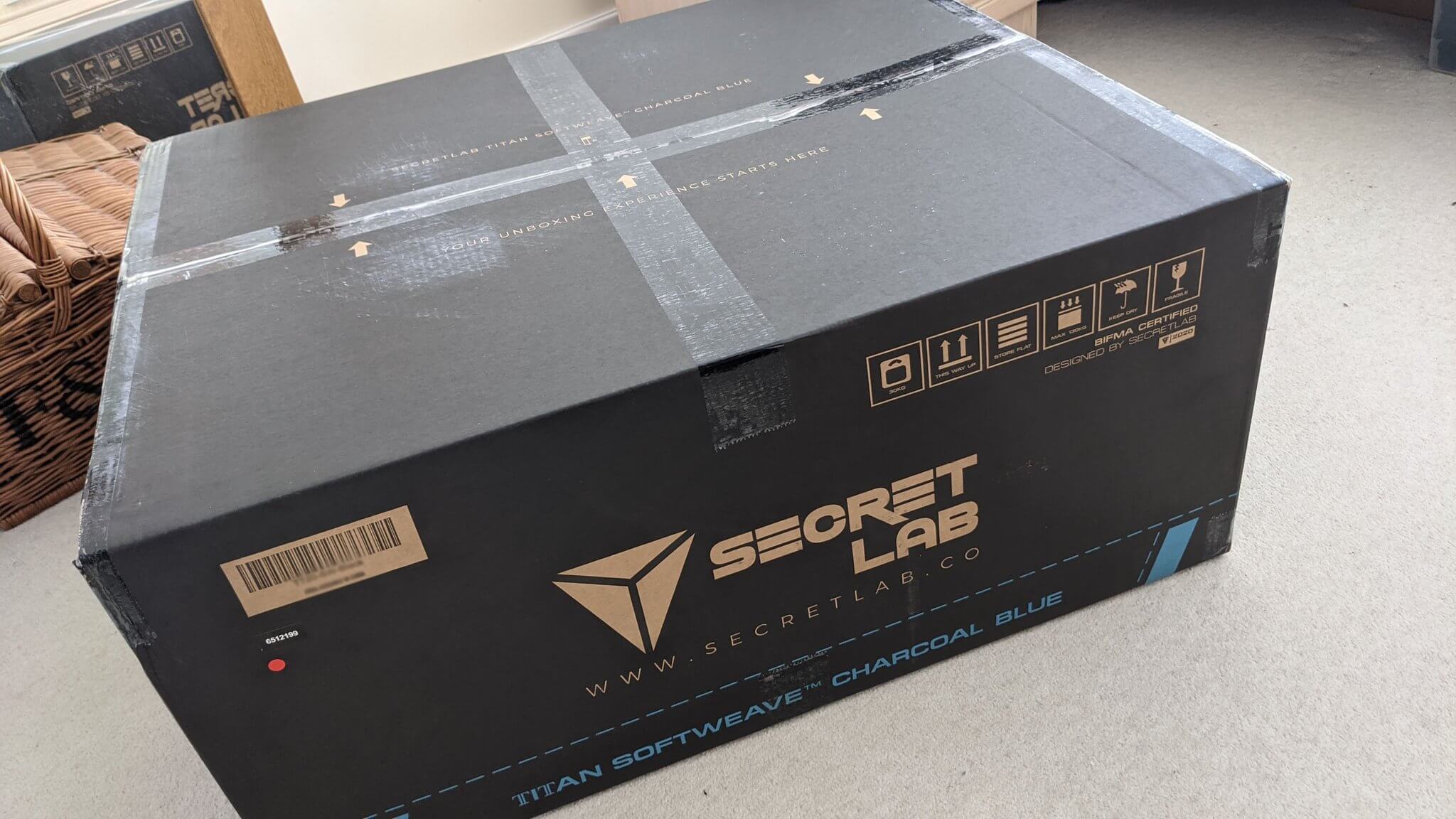
SecretLabs specializes in gaming chairs marketed at video gamers; besides being ergonomically styled for hours of sitting, they come with a distinct branding aimed at the sort of person who has a Steam account and probably custom-built their PC with gaming in mind. Naturally, their packaging reflects this with a font that evokes a sort of SciFi/military of the 22nd-century aesthetic that fits right in with their target audience.
The unboxing experience keeps with this feeling. Warranty information and care instructions come in a welcome packet that says “SECRETLAB ACCESS,” a tongue-in-cheek homage to popular video games like Call of Duty or SEAL Team 6, where the gamer oftentimes completes covert, top-secret missions. The chairs require a multi-step assembly, so instructions complete with diagrammed photos and boxes containing neatly separated parts make the process less intimidating. Printing the assembly instructions – in color, no less – on a single glossy sheet of posterboard is especially smart given the fact that customers have hated reading instruction manuals for decades.
Once your customer gets inside the box, there is typically infill to protect the product. Even this can be used as a way to tie the theme of the packaging together. Think about your current infill: can it be more fun, fit your brand, or be less wasteful? Consider trading in those plastic air bubbles for kraft paper or colored shredded crinkle paper to better represent your brand identity.
However, the most important thing to remember is that your top priority is getting the products to your customers intact. A well-packaged product that arrives intact is always preferable to a fun unboxing experience, so don’t sacrifice safety for fun.
Sustainability
Interwoven into each step of the shipment packaging process is the question of sustainability. Customers are more educated about sustainable practices than ever, and they care that companies are not only conscious of their impact on the planet but that they are taking active steps to do better. As of last year, two thirds of Americans preferred eco-friendly brands, and that percentage will only increase.
Knowing that customers are knowledgeable about good and bad environmental practices means that brands need to commit to doing their research, and make sure they’re making informed choices to lessen their impact and follow best practices for sustainable packaging – but the good news is that it’s cheaper and easier than ever before to make those changes.
The saying is “reduce, reuse, recycle” for a reason: that’s the order in which you should focus your efforts. So let’s go over each step and how you can apply it to your custom packaging:
Reduce product packaging
At every level of the packaging process, less is more. This is most obvious in box size. We all hate getting enormous packages for tiny products, and yet it still happens all the time. Cutting down on excess space is not only an effective way to save money on materials and shipping costs, but customers love an efficiently packed box.
Aside from box size, be intentional about what you include. Less is more when it comes to extras. The more “stuff” you try to give your customers for free, the more likely they are to just see it as junk (and your company as needlessly wasteful) and toss it in the trash. Think critically and strategically about any extras you include, and your thoughtfulness will be noticed.
Reuse product packaging
Product packaging can be reused in any number of ways. For customers that already care about the environment, it may be as simple as printing a quippy little reminder on the package that it’s reusable. But it can’t hurt to include some ideas for package reuse. Adding on a blurb on the last page of instructions, on the inside of a box, or even in the shipping confirmation email you send is a nice way to remind your customers that the end of life for your packaging need not be after it arrives on their doorstep.
Also, think about how the elements you include can have multiple purposes – a thank you card that has an art print on the other side, or a sticker that has a cute illustration with your company name in the corner. A major packaging trend for 2021 is plantable packaging, which can be planted and watered to grow flowers or vegetables.
Recycle product packaging
While recycling is typically the first step that comes to mind with sustainable packaging, you can see that reduce and reuse should be a higher priority. And while having recyclable packaging is always better than packaging that is single-use and landfill-bound, you’ll want to do your research first.
Sustainable materials can be a little tricky, and the differences between compostable and recyclable packaging are important. If you’ve ever gotten a bubble mailer that’s labeled as recyclable, it’s most likely only recyclable at certain grocery stores. A compostable package sounds good, but if it ends up at a landfill, it won’t actually break down (a proper compost needs a good balance of green and brown components, as well as good airflow, and landfills have neither of those things). Packaging can be labeled as biodegradable but isn’t bound by any timeframe, which means it could take hundreds of years.
Eco-friendly branding and packaging is no longer just for the hippies. In 2021 it’s practically mainstream. By thinking holistically about how you can address and reduce your impact on the environment, you can show your customers that you care about what they care about.
Conclusion
Shipment packaging is a blank cardboard slate, and unfortunately many brands leave it that way without getting too creative or thoughtful about its potential. However, it’s a great opportunity for you to connect with your customers and make a great impression before they even get the chance to enjoy your product.


