- One Piece logo: Backstory, meaning & design
- Pirate flags
- “One Piece” logo upgrade by Netflix
- Bottom line
“One Piece” refers to the world’s highest-grossing media franchise which is based on a wildly popular manga series authored by Eiichiro Oda. Besides the manga itself, the franchise also includes a feature film, video games, and Netflix-produced action series. By the way, Netflix is releasing new “One Piece” episodes on July 22. Mark your calendars! While the whole world is waiting for the new One Piece content, allow us to break down the compelling visual symbols from the iconic pirate saga.
One Piece logo: Backstory, meaning & design
Eiichiro Oda started working on “One Piece” in 1996. The manga tells a story of a boy who acquires superpowers after eating an unusual fruit. The boy’s body undergoes a stunning transformation, becoming pliant and flexible like rubber. He joins a pirate crew and travels the world hoping to find the treasure known as “One Piece” and become a new king of pirates.
What is Jolly Roger?
The “One Piece’ logo features the notorious Jolly Roger, a globally recognized symbol of pirates. A skull and crossbones against a black background are instantly interpreted as deadly danger. The image is widely used on flags, clothing, tattoos, and so on.
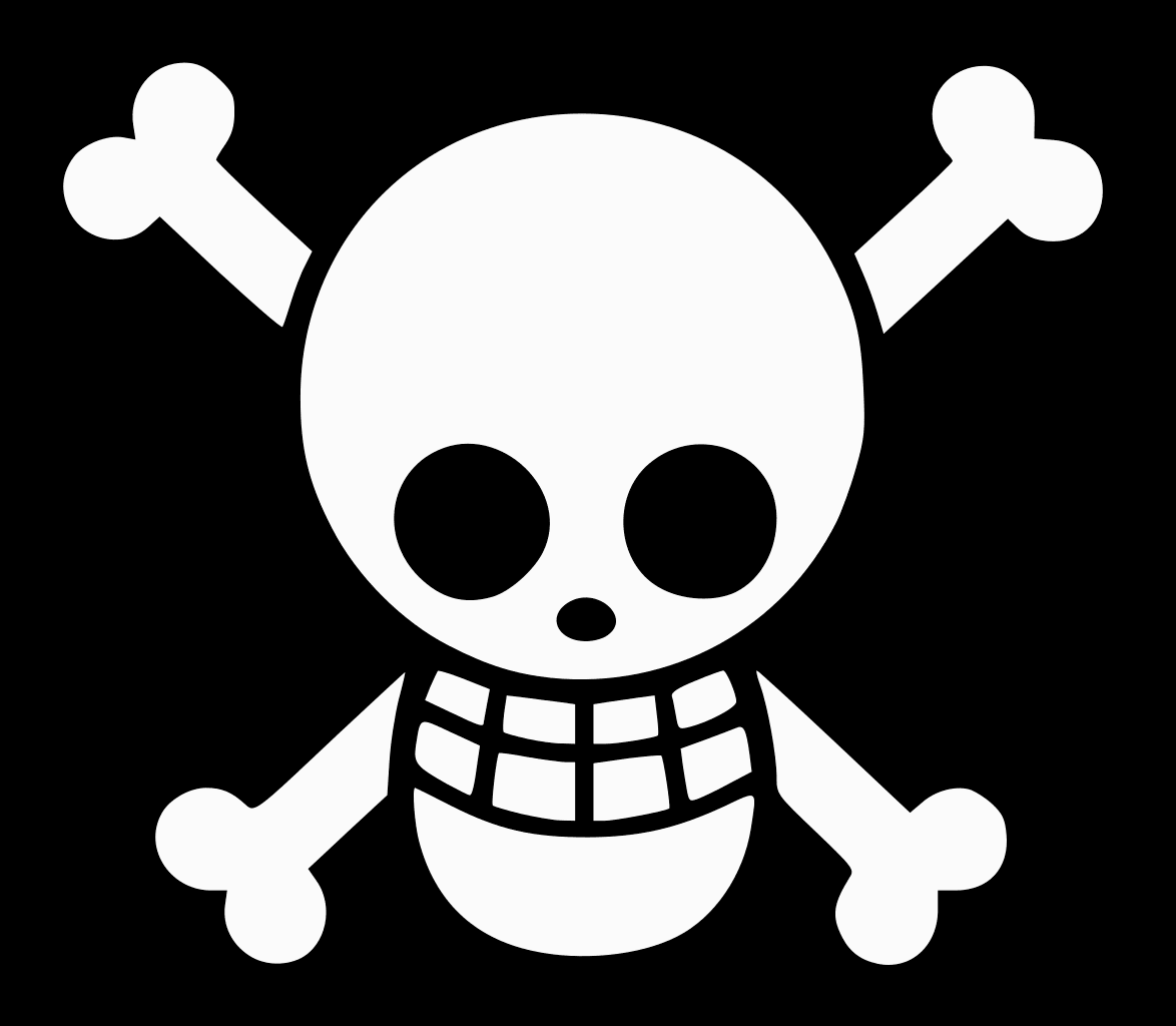
Since the 1800s, the world has seen numerous variations of Jolly Roger. Let’s take a look at the three hypotheses of how the iconic emblem came to be.
- According to the main hypothesis, Jolly Roger takes its name from the French phrase “jolie rouge” which means “pretty red”. It is believed that French pirates used to sail under a red flag, and not a black one. Associating with blood, the color red characterized pirates as fierce and merciless villains.
- Another version says that the flag’s name originates from the French word “rogue” which means “swindler”.
- Finally, some researchers argue that the flag has to do with Old Roger which is an old-time nickname for the Devil himself.
Meaning behind the “One Piece” logo
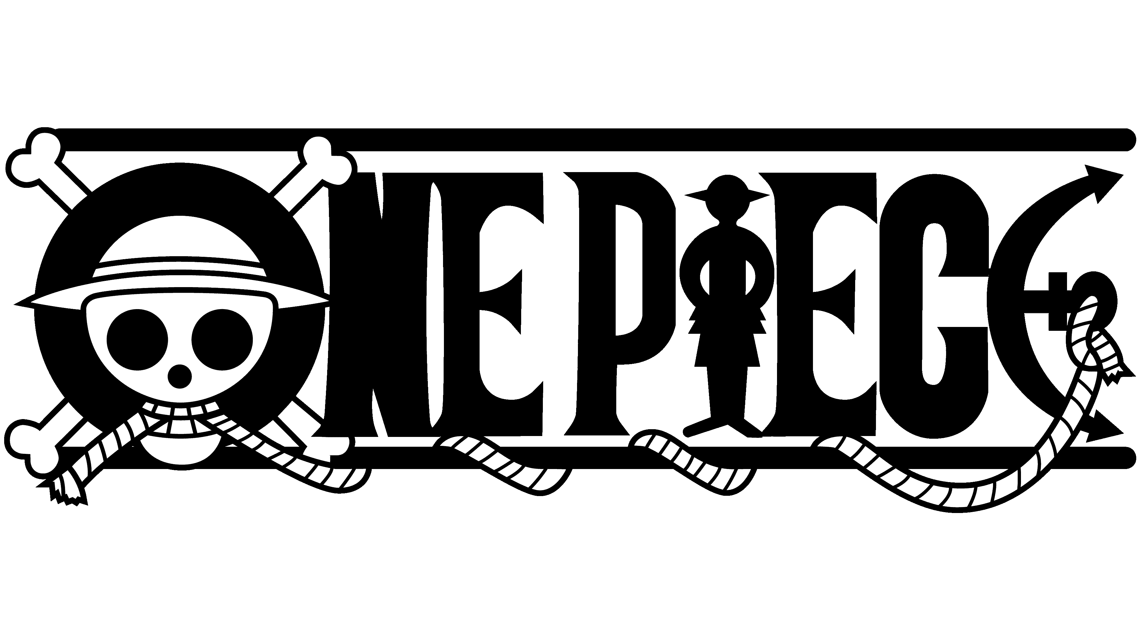
The main visual symbol for ‘One Piece” dates back to 1999. The logo is a fine balance between engaging graphics and smart typography. When looking at the design, your attention is drawn to three particular letters that have been visually transformed for a deeper meaning.
- The design of the letter “O” is a nod to the Jolly Roger flag. In the center of the letter, you can see a skull wearing a hat and holding a rope between its teeth. The dreary image is completed with bones protruding throughout the perimeter of the letter.
- There’s a rope that entwines the entire logo. The rope is tied to the last letter “E” which is stylized as an anchor.
- The letter “I” is replaced with the silhouette of a man (presumably, the protagonist of the saga).
Colors and font
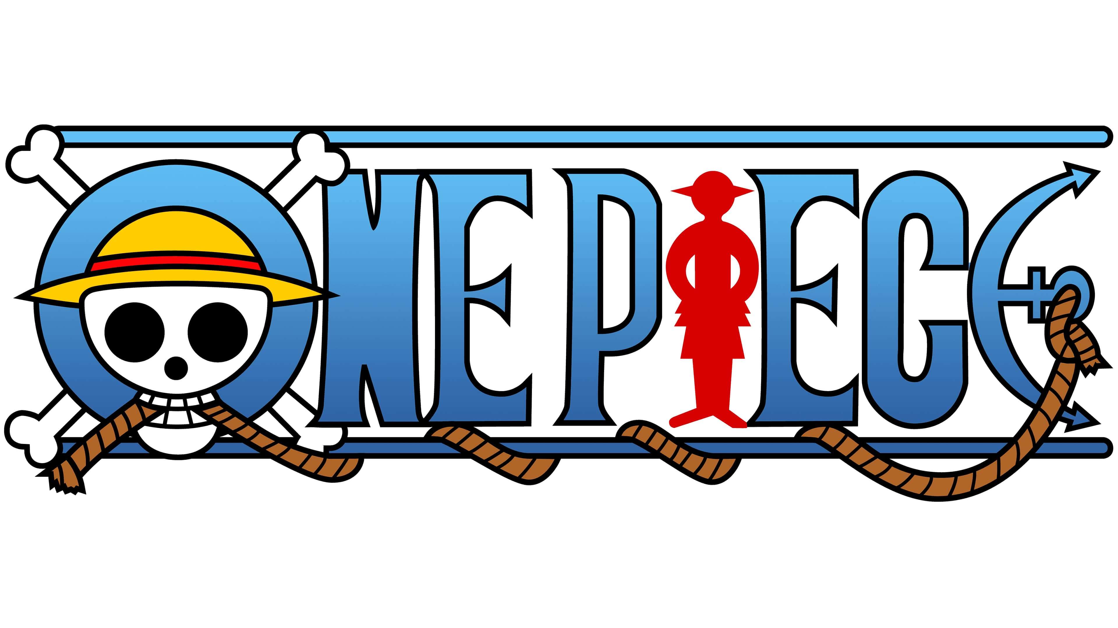
In terms of colors, the “One Piece” emblem relies on gradient blue that stands for the sea. Plus, the logo features the following shades:
- black and white (skull, bones);
- yellow (skull’s hat);
- red (stripe on the hat, silhouette);
- brown (rope).
The letters are voluminous and slightly elongated, with a black edging. Small serifs make the logo look bold and even aggressive.
Pirate flags
When reading the “One Piece” manga or watching the action series, you come across dozens of Jolly Roger flags. By carefully studying the particulars of each flag, you can guess which crew it belongs to. Each banner gives out a number of hints, whether it’s a fundamental characteristic of the crew or the appearance of its captain.
Straw Hat Pirates
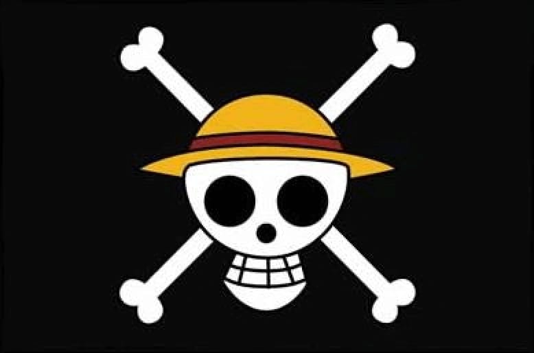
Meet a “friendly” version of the Jolly Roger flag! On it, you can see a smiling skull wearing a straw hat that belongs to the protagonist.
Big Mom Pirates
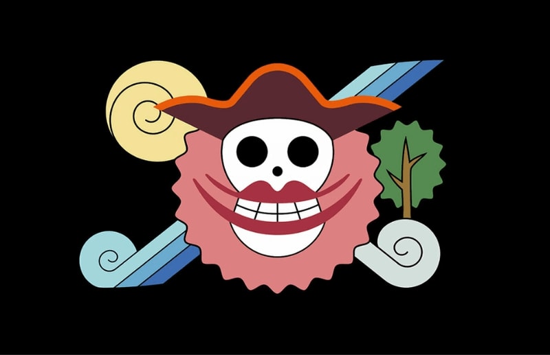
Representing the “Big Mom” pirate squad, the logo is easily recognizable through its female theme, such as red lips and pink background. The iconic crossbones are replaced with lollipops.
Arlong Pirates
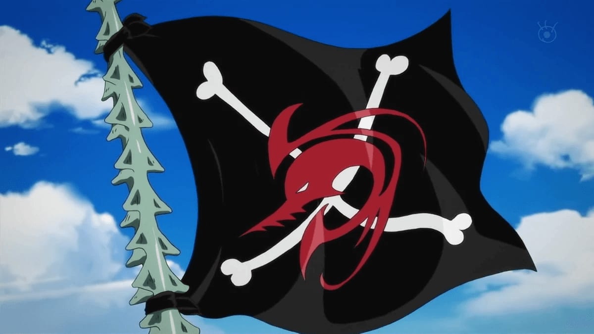
Members of this pirate crew are a hybrid between the fish and the human. That’s why the emblem features a red predatory fish instead of the familiar skull and thin fish bones instead of human ones.
Bellamy Pirates
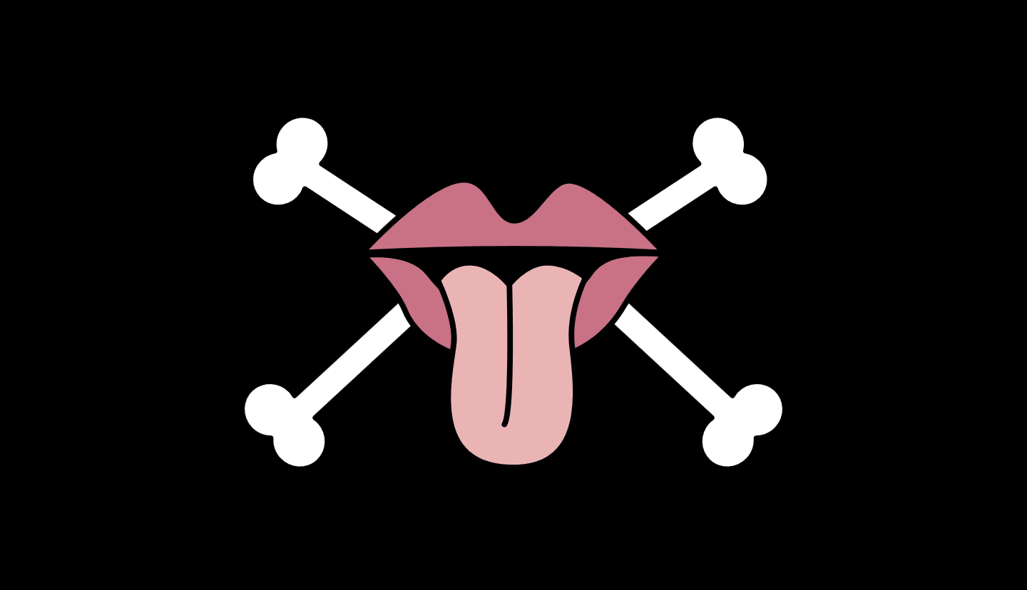
Captain Bellamy’s personal flag sports red lips with a tongue sticking out. As for the rest of the crew, they have their own banner, the Donquixote Pirates flag, that we’re going to look at below.
Black Cat Pirates
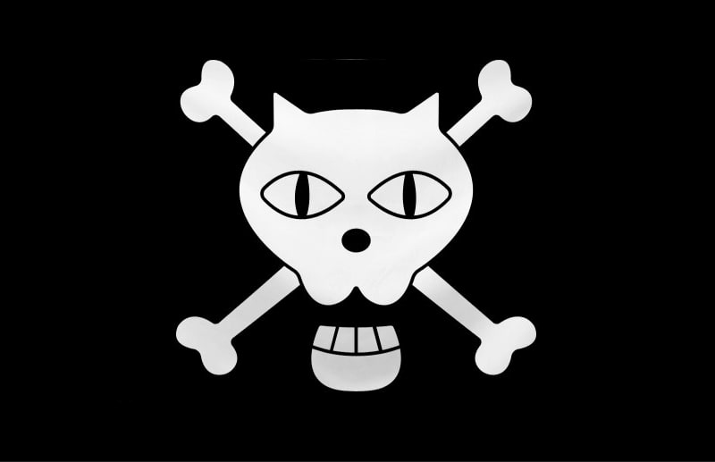
The name of this pirate crew gives away the concept of its logo! The human skull in it is replaced with that of a cat. The dead big-eyed feline is smiling at us with a predatory grin.
Donquixote Pirates

This next banner features a friendly smiley face, except that it’s crossed out. There’s hardly a better way to tell everyone that the Era of Dreams is over!
Flying Pirates
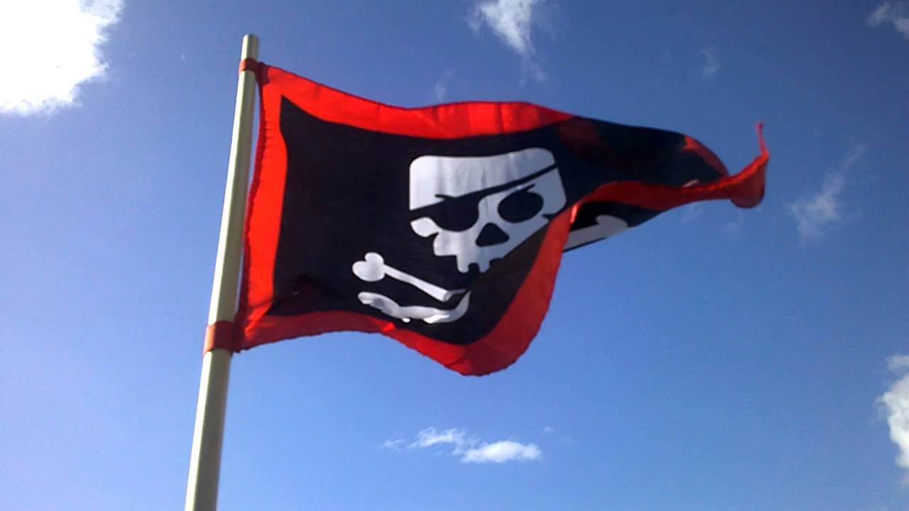
We can bet that you’ll remember this scary Jolly Roger for the rest of your life! It lacks a lower jaw and has razor-sharp fangs instead of teeth. As for the crossbones, they gave way to crossed sables.
Foxy Pirates
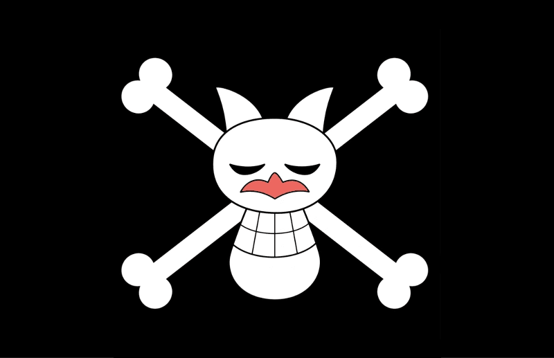
The logo features Foxie, a silver fox who is in command of this pirate crew. In the upper part of the emblem, the word “fox” is written with hieroglyphs.
Krieg Pirates
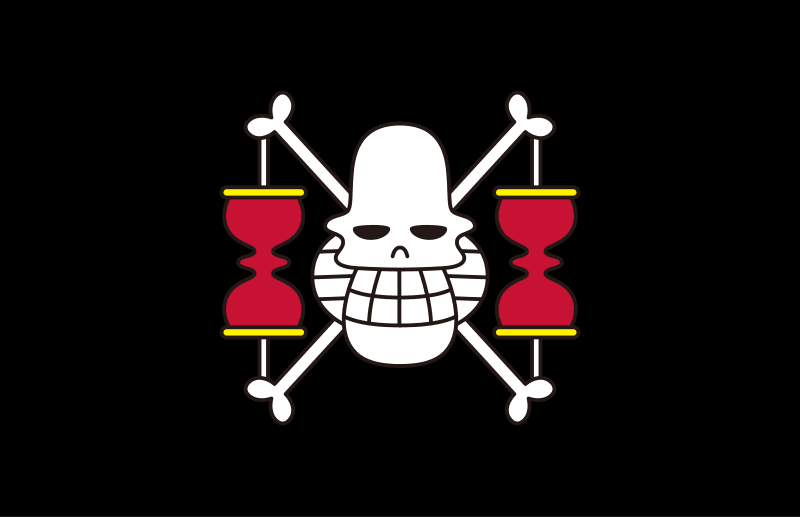
The logo reflects the main peculiarity that makes the members of this pirate squad stand out. As you might’ve guessed, we’re talking about their unusual height! Just like the captain of the ship, the skull has side whiskers. A red hourglass on both sides of the emblem serves to remind the enemy that their time is over.
Kuja Pirates
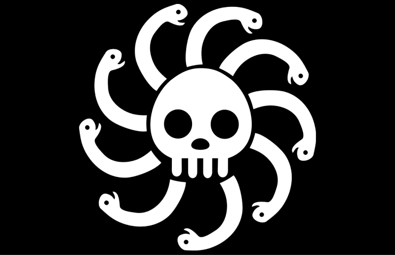
Nine snake heads that surround the skull are a direct visual reflection of the crew’s name, Pirates of Nine Snakes. The logo is all about curved lines and shapes.
Roger Pirates
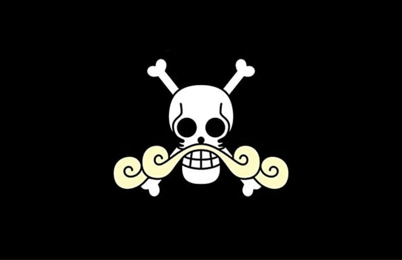
The next flag on our list stands out through a lush curly mustache, the unmistakable trademark of the late king of the pirates.
Straw Hat Grand Fleet
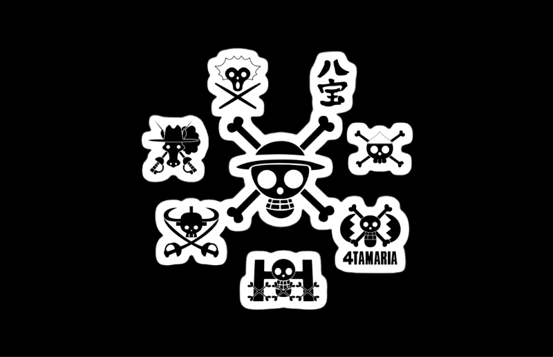
The Grand Fleet in “One Piece” includes as many as seven pirate crews, with each squad having a unique flag of their own.
Sun Pirates
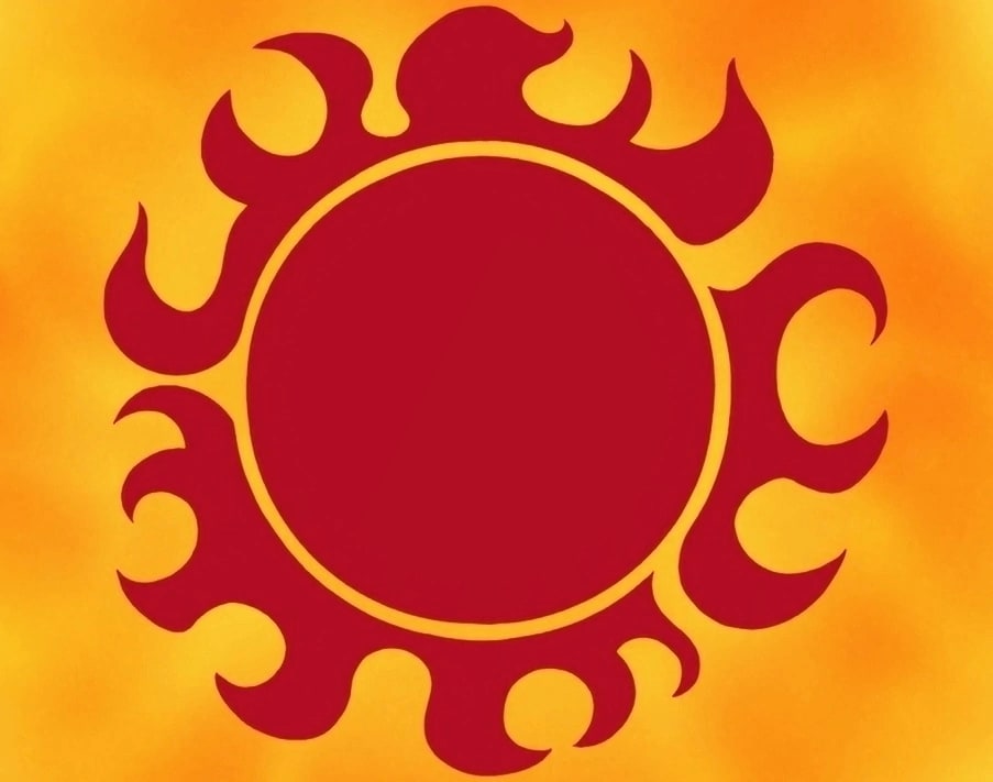
Quite unexpectedly, this pirate squad chose a red sun shining against a yellow background as their symbol. The logo lacks the familiar skull and crossbones.
Thriller Bark Pirates
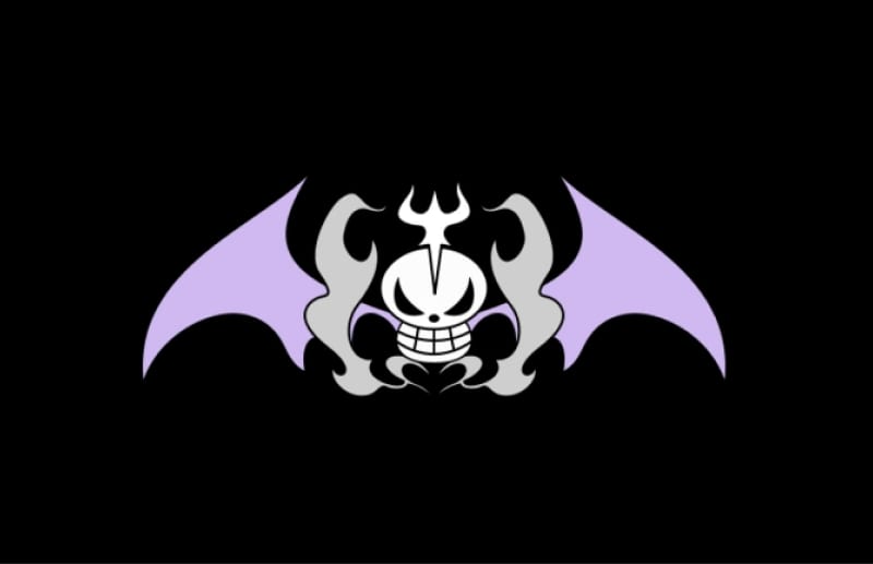
Decorated with two violet wings and tongues of flame, the skull on this flag gives off dark enigmatic vibes. It’s an ideal visual interpretation of a mysterious pirate crew like this one!
“One Piece” logo upgrade by Netflix
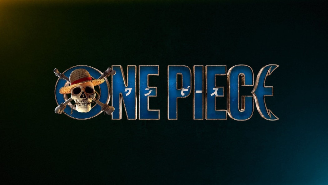
As we’ve mentioned earlier, Netflix is adapting the Japanese pirate saga into a television series. In September of 2021, the streaming platform presented a new branding for its new show. The goal was to upgrade the old logo while keeping the unique visual identity that the manga was famous for.
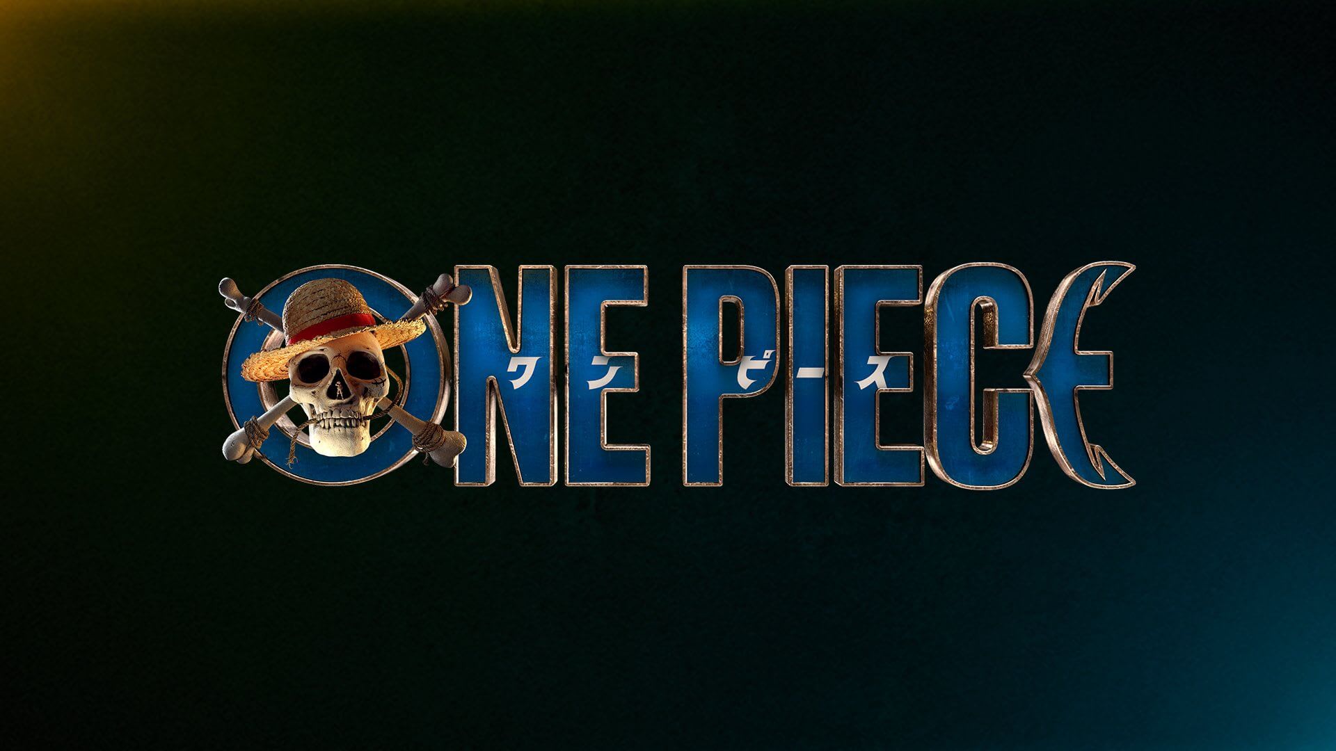
The design kept its hallmarks, such as the color blue, skull in the letter “O”, and the anchor-shaped letter “E”. At the same time, graphic designers spiced up the logo by using edgy techniques, such as:
- simple and minimalist font without serifs;
- photorealistic Jolly Roger with recognizable elements (straw hat, rope, human silhouette);
- gilded shadows around letters for greater realism.
Looking to use one of the above techniques to elevate your logo? The ZenBusiness Logo Generator branding constructor will get it done in just a few clicks! ZenBusiness is your ultimate source of modern fonts, appealing icons, and ready-to-use color palettes.
Bottom line
A head-spinning variety of logos from the “One Piece” saga are a great example of how you can transform generic symbols into something new and exciting. Go ahead and apply this approach to your company’s branding. Take a visual symbol related to your business and enhance it with one or two memorable elements. At the same time, be sure to keep your design simple and easy-to-read.
