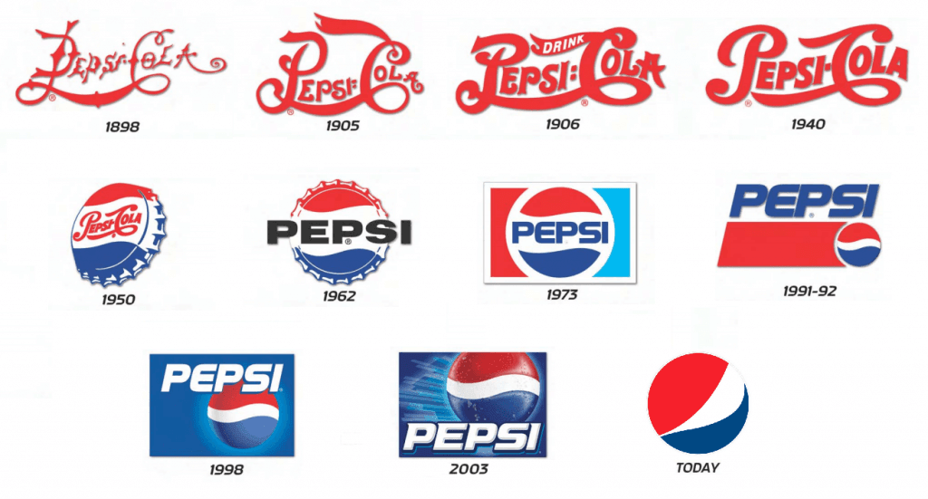
The popularity of the Pepsi logo is best illustrated by the fact that during the 2018 Olympics it was mistaken for the South Korean flag. The instantly recognizable combination of red, white, and blue can be seen at every gas station, shop or restaurant. Read this article to follow the iconic logo on its more than 100-year journey!
- Hidden meaning behind the Pepsi logo
- Who designed the first Pepsi logo
- Logo evolution
- What is “isded”?
- How would Pepsi logo look like if it were made in ZenBusiness?
Hidden meaning behind the Pepsi logo
In 2008, Pepsi splurged 1 million dollars on a new logo with a secret meaning. The design of the new emblem channels the ideas of the golden section, Earth’s magnetic field and gravitation, fengshui, and other fields of knowledge. Encrypted meta messages were meant to add more appeal to the brand and forge an emotional bond with the customers.
Who designed the first Pepsi logo
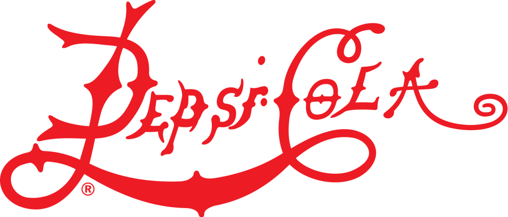
In 1898, a pharmacy owner named Caleb Bradham invented and started to sell the so-called “Brad’s Drink”. In 1903, he patented the Pepsi Cola beverage that included two main ingredients — pepsin (digestion enzyme) and cola nuts. It was then that Bradham came up with the first logo for his delicious product. It was the word “Pepsi Cola” in a red hand-written font, with the letters P and C linked with each other.
Logo evolution
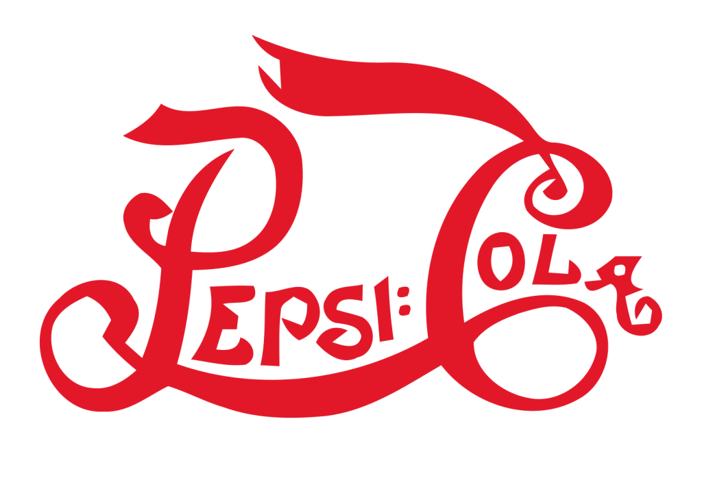
In 1905-1906, the original logo went through a series of improvements. First, the emblem got a more massive font. Then it was decided to add the word “Drink” to the composition. The resulting design served the company for several decades.
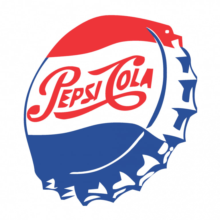
In the early 40s, CEO of Pepsi came up with the idea to put the company logo onto the bottle cap and add the blue color to the mix. The redesign pursued two goals – to stand out from Coca Cola and show support for the United States during World War II (red, white, and blue are the three colors of the US national flag). The revamped design received a warm welcome from the public and remained without changes all the way until the 70s.
In 1973, Pepsi introduced a new minimalist emblem that looked great on the Pepsi bottle label. Over the next 20 years, the company played around with hues and rearranged the elements on the logo. In 1998, to celebrate Pepsi’s 100th anniversary, the logo underwent another overhaul, changing the white background for a blue one and gaining a striking 3D effect.
The Pepsi logo as we know it today is a textbook illustration of all modern design trends. A concise red and blue circle with a white curvy stripe makes you think of a happy, smiling face. Simple and up-to-the-point, the emblem fits any carrier, from mobile apps to T-shirts.

What is “isded”?
Customers have spotted a curious thing about the Pepsi logo. If you turn it upside down, the company name reads “isded”, which almost sounds like “is dead”. The discovery gave birth to countless Internet memes and YouTube videos where people turn Pepsi bottles upside down. Thanks to the hype around the brand name, Pepsi saw a huge spike in popularity.
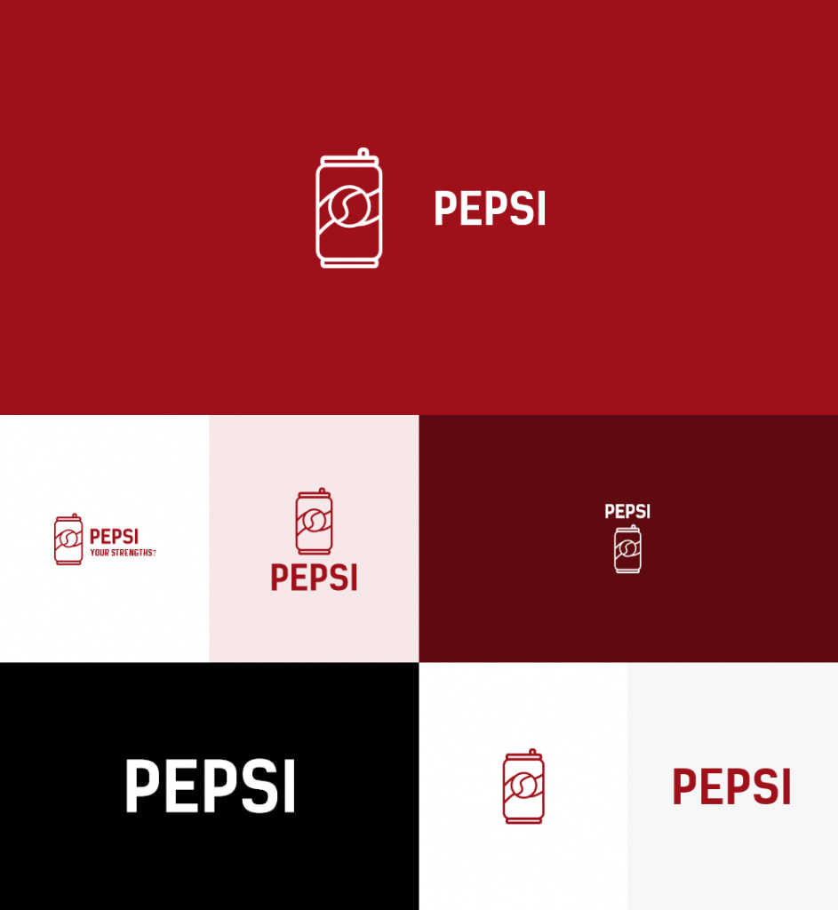
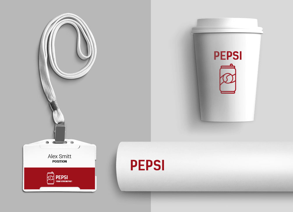
How would Pepsi logo look like if it were made in ZenBusiness?
Final thoughts
Despite numerous overhauls, the Pepsi logo has always stayed true to its unique visual identity. While adapting the emblem to fit modern trends, the company has always been wise enough to keep its essential design elements, such as colors, circle shape, and curves. With its logo, Pepsi has managed to achieve a fine balance between modernity and timelessness.

