Want to create an easily identifiable logo? Make it clean. This is exactly what Target, a major mass-merchandise retailer, did with its emblem. The Target logo was ranked among the world’s most recognizable emblems. Learn why the company’s corporate identity has been a huge success for more than 50 years now.
- Logo evolution
- Secrets of successful design
- How would Target logo look like if it were made in ZenBusiness?
Logo evolution
In 1962, the company’s PR team had to sift through more than 200 business names before it opted for “Target”. The name dictated the logo choice. This is how a red bull’s eye became the symbol of the US retailer.
In 1968, Target streamlined its emblem, leaving just one ring around the red dot. One year later, Target decided to celebrate the opening of a new outlet by presenting a new take on its visual identity. It designed a series of posters that portrayed a woman wearing an earring stylized as the company logo.
In 1975, the red dot was joined by the company name written in a massive black font. In 1989, the brand did some drastic changes to its corporate design. They removed the bull’s eye, only leaving the name “Target” written in a red italic font with a white shadow. Unfortunately, the new design turned out to be a marketing flop, and the retailer got back to its previous emblem.
The modern version of the Target logo came into existence in 2006. The focus shifted to the bull’s eye that was made even more vibrant and solid. The brand name was removed as an excessive element.

Secrets of successful design
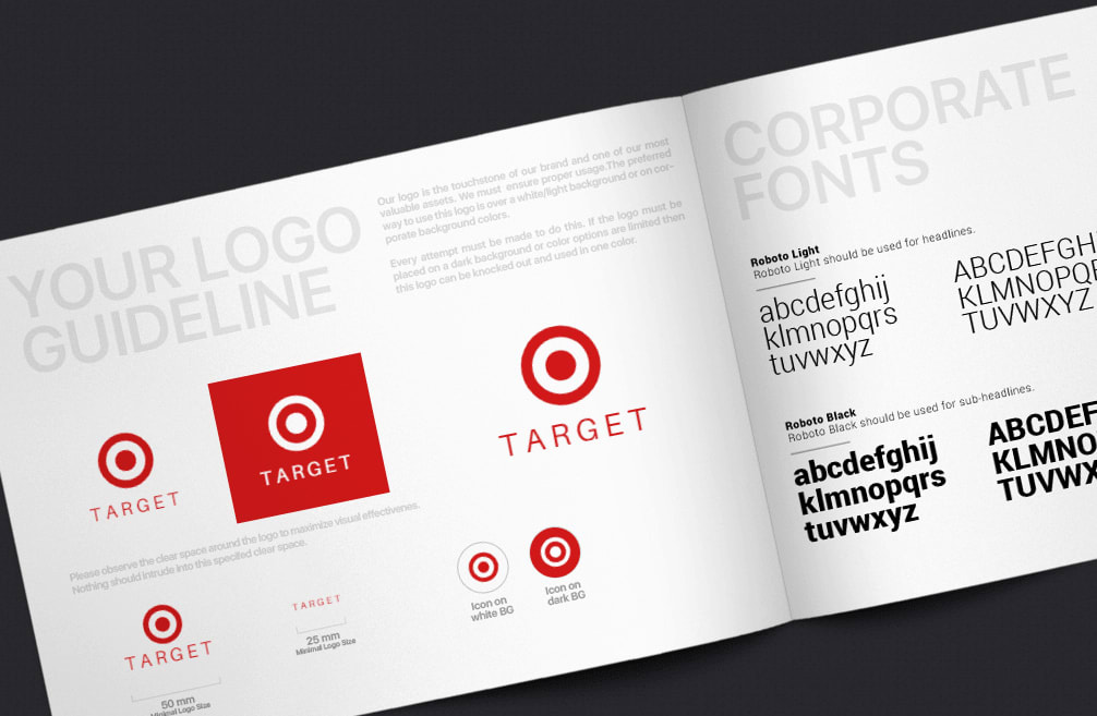
On the modern Target logo, you can see a red dot surrounded by two circles, a white one and a red one. Also, there is version for a dark background that uses the black color instead of white.
The classic red and black palette looks great across a variety of backgrounds and builds emotional connections. Red stands for love, passion, and energy. Plus, it’s really good at grabbing a viewer’s attention. White creates a nice contrast to red, associating with style and elegance.
What makes the Target logo snappy:
- Clean design. A minimalist logo is easy to spot from afar (e.g., when you’re driving on a highway) or when you’re scanning the content.
- Circle shape. Symmetry creates a harmonious composition.
- Positive associations. Both the company name and its visual symbol transcend the idea of success and prosperity.
How would Target logo look like if it were made in ZenBusiness?


Conclusion
The Target logo has kept its key message through multiple redesigns. Thanks to its effective color scheme and clean composition, the iconic bull’s eye has entered the history of graphic design, setting the bar as high as never before.


