- The Smw Fonts for Different Brands: Allowed or Not?
- Well-known Fonts: How They Appeared and Where They Are Used
Are you looking for a perfect font that would convey the nature of the company, be easy to read, and look relevant? We offer you to learn from the experience of well-known brands. You’ll find out the 13 popular fonts they use and who they will suit.
The Smw Fonts for Different Brands: Allowed or Not?
Think of the logos of Bayer and Fendi, Kappa and Energizer. They seem completely different at first glance, but they are inspired by the same font, Helvetica, which is considered the champion in popularity for brand identity development due to its versatility.
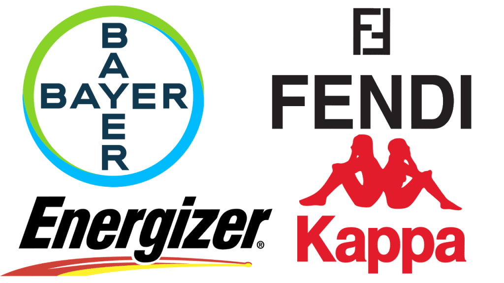
This is quite a common situation for branding: many companies choose the same typography when developing their corporate identity. At the same time, their personality is emphasized in such ways:
- various outlines (there can be up to several dozens of them);
- designer’s work that adds distinctive elements to the letters;
- brand colors.
Well-known Fonts: How They Appeared and Where They Are Used
To get inspired to create your own logo, we suggest exploring several popular types of typography.
1. Bodoni
It appeared back in the 18th century thanks to the famous Italian typographer and publisher Giambattista Bodoni. Due to the combination of thick and thin lines, and sharp perpendicular serifs, Bodoni looks contrasting and dramatic. It looks best in large versions, like Vogue’s and Nirvana’s logos, as well as posters for the musical “Mamma Mia!”.
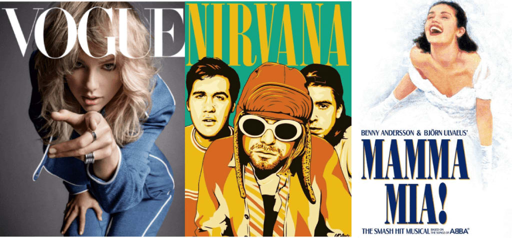
This outline will suit brands that want to communicate their expression, e.g., fashion- or art-related.
2. Choplin
This pure geometric font based on the Campton font family was created by the modern German designer René Beider. The round letters with neat serifs look laconic and are easy to read. Choplin is often used not on logos but in printed marketing materials.

3. Garamond
One of the oldest fonts developed in the 16th century in France by Claude Garamond influenced the whole European typography. Today Garamond is a family of different typefaces characterized by small serifs, moderate contrast, and rounded shapes.
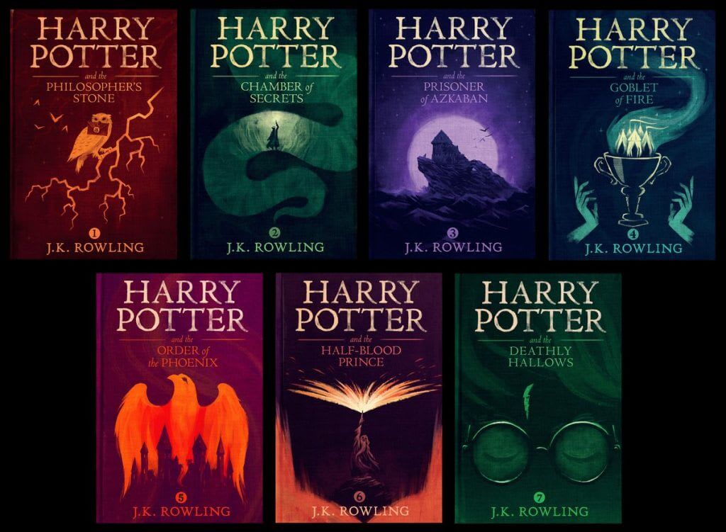
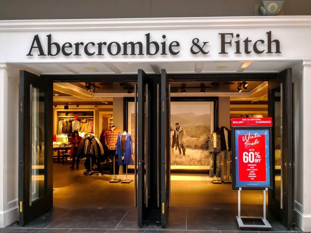
Garamond is often chosen for magazines, newspapers, and books such as the American publications of “Harry Potter”. For marketing purposes, it was used by Apple for some time (a version called Apple Garamond). You can also see it in the American Eagle and Abercrombie&Fitch logos.
This font family is worth choosing for companies that are not chasing trends and want to make the identity look refined and elegant.
4. Didot
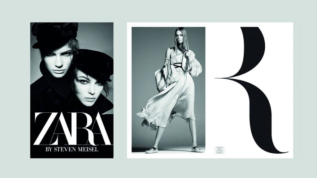
It was named after the French family Didot who were engaged in book printing and type producing in the 18th-19th centuries. Circular lines, contrast, and small serifs create an impression of chic and status. During a survey conducted by writer and printer Sarah Hindman, the audience rated Didot as the most expensive font.
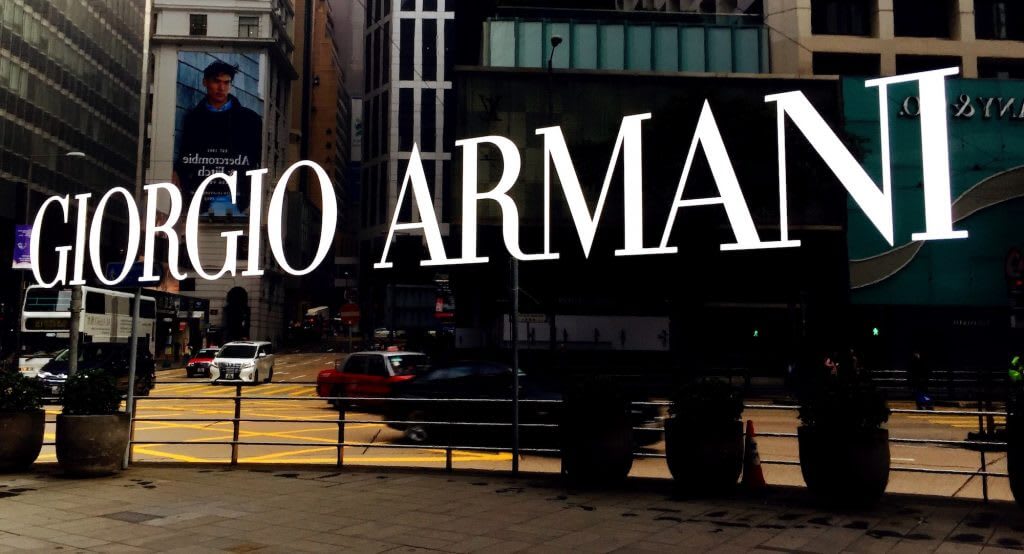
Similarly to Bodoni, Didot is popular in the world of fashion and creativity (Giorgio Armani, CBS, Zara). It is suitable for companies that want to look expensive, mature, and stylish.
5. Baltica
This font was developed by the team of Soviet designers in the early 50s of the 20th century. Although it is close to a slab serif, it is distinguished by its thin and direct serifs.
Due to its good readability, Baltica is often chosen for media. It can also be seen on the Winston logo. This type of typography is suitable for brands with classic style.
6. ITC Lubalin Graph
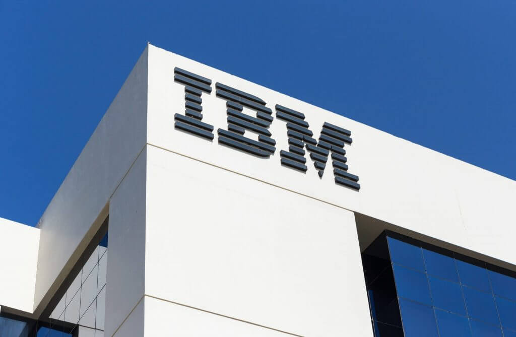
The design of the geometric font, presented in 1974 is based on ITC Avant Garde Gothic. Intensive serifs were added to it, and the letters were placed closer to each other. Their sharp bends make the inscriptions more dynamic.
One of the bold inscriptions of ITC, Lubalin Graph, was used for the IBM logo. Such an identity conveys the energetic, but not aggressive nature of the company.
7. Futura
The font appeared in the early 20s in Germany, in the era of numerous artistic experiments associated with the Bauhaus style. Today, Futura has become a classic serifless font. Due to its geometric shape, the letters look simple, clean, modern, and easy to read on any medium.
Futura is very common for branding: Nike and Cisco, Dolce Gabbana and Gillette, Omega and PayPal, posters for dozens of movies including “Gravity”, “Interstellar”, “American Beauty”. Fortunately, the variety of styles allows adapting to almost any business.
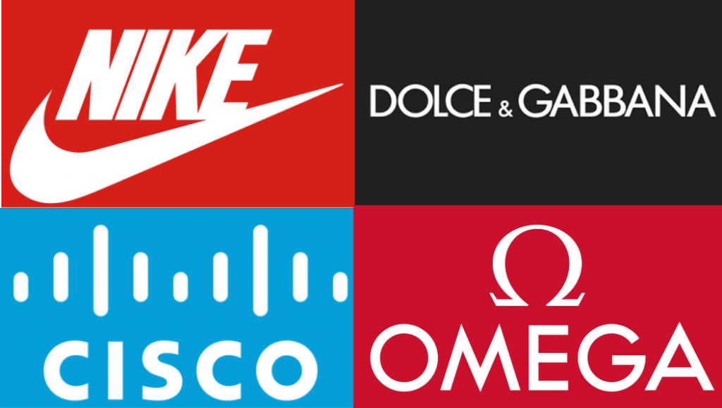
Companies that choose Futura for their logo should be creative in order not to merge with other brands and show their personality.
8. Univers
It was designed in the 1950s by the Swiss designer Adrian Frutiger. He wanted to avoid perfect geometry and kept “visual sensitivity between thick and thin lines.”
The modern Univers is a large and popular serifless font family used by well-known brands (eBay, Swiss International Airlines, BP, Unicef, Western Union) and municipal and transport services (street navigation in London, Toronto Metro, Frankfurt Airport).
Univers is suitable for brands looking for simple, versatile, and readable typography.
9. Neo Sans
In 2004, the British designer Sebastian “Seb” Lester drew a universal futuristic font that would not look “rough, useless, or ephemeral”. The lack of serifs and intense rounding create a friendly mood.
You can recognize Neo Sans in the Intel logo as well as in urban navigation, e.g. in the British public transport companies. It is worth choosing if you want to create an image of a brand that is close to consumers and easy to understand.
10. Proxima Nova
Proxima Nova is often called the new Helvetica because of its versatility and modern appearance. According to designer Mark Simonson who created this font in 2005, he “tried to make the letter shapes simple and clear.”
The combination of classic geometry and modern proportions has made the family of 48 fonts one of the most popular: today it is used by thousands of websites including BuzzFeed, Mashable, and NBC News.
“Proxima Nova works best in situations where you need something invisible that doesn’t draw attention to yourself,” Simonson says. – In fact, it doesn’t convey anything except for the words you wrote in it.” This means that Proxima Nova will look better not on the logo, but a website or a corporate blog.
11. Alternate Gothic
The gothic typeface without serifs was drawn by Morris Fuller Benton in 1903 as an analog of Franklin Gothic. It is characterized by the letters stretched in height and narrowed in width – as on the emblem of YouTube. Alternate Gothic is worth considering if you want to convey a strong confident nature of the brand.

12. Pico
This playful font was released in the early 2000s by the Japanese company Maniackers Design. Pico is easy to recognize by its soft rounded lines such as in the Twitter logo. This typeface is perfect to convey the mild, friendly nature of business.

13. Myriad
In 1992, designers Robert Slimbach and Carol Twombly developed a new typeface for Adobe. The lack of serifs, clean forms, well-drawn proportions of letters made it readable and universal.
Myriad can be seen in the branding of Apple until 2017, Wells Fargo, Modern Telegraph, Nippon Airways, LinkedIn, Rolls-Royce, Walmart. It is worth using if you want to convey simplicity and laconicism.

Summary
Well-known brands often use popular fonts for their identities without fear of losing their personality. To easily emphasize the uniqueness of your company, you should follow a few simple rules:
- Determine the nature of the brand and the feelings you want to evoke from your target audience.
- Pick one or more fonts that reflect your personality (a lifehack for you: explore famous brands with similar character and see what typeface they use).
- Use ZenBusiness’s online service to create a logo and customize it in a few clicks by choosing the right fonts and colors.
- Test the logo on the target audience to make sure it evokes the emotions that you intended.
