Dive into the dynamic world of logo animation, where creativity knows no bounds, and learn how to bring your brand to life with an interactive logo design that not only captivates but also inspires and engages your audience in a whole new way.

Starts at $0 + state fees and only takes 5-10 minutes
Last Updated: July 2, 2025
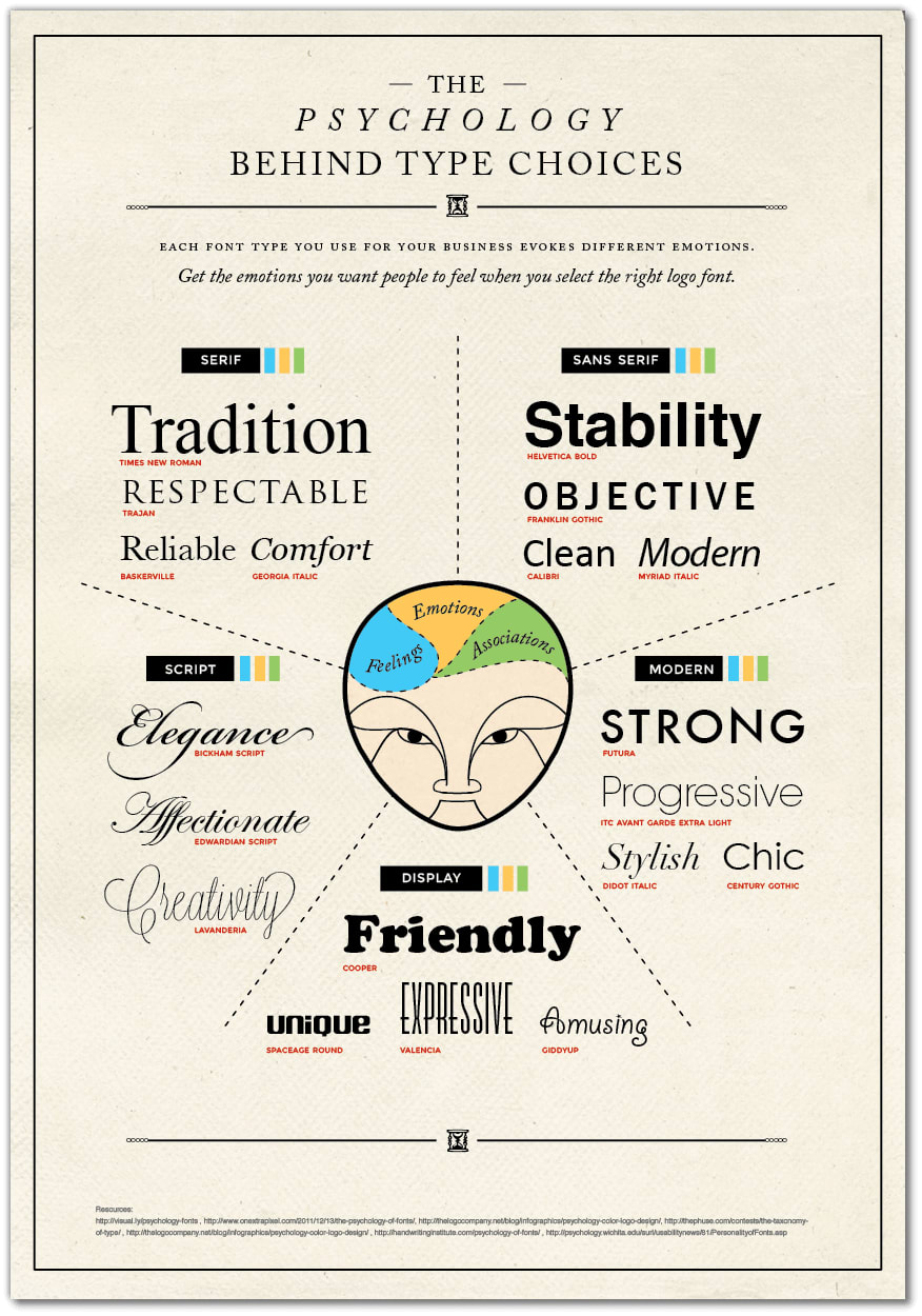
Font is an integral part of any logo. The importance of picking the right font should not be underestimated.
A well-selected font can emphasize the advantages of your logo and brand, while an inappropriate font may evoke nasty associations and undermine trust.
While editing your logo in ZenBusiness, you can select the best font for your logo. To make the task easier for you, we’d like to share some useful information about font types and specifics.

A logo with a clean font is easier to reproduce across different products. Remember that you may have to enlarge or reduce it. Make sure your logo looks attractive on any surface, whether it’s a large banner, a pen, or promotional materials.
Your goal is not to imitate but to analyze whether their solutions are smart. Only learn from successful experience.
A font makes your logo recognizable and memorable. Find out which font suits your company best. Is it serious, clean, and neat? Or is it playful, airy, and chaotic? Does it communicate novelty or does it cling to traditions and conservative ideas?
Different industries rely on different values which are communicated through different fonts. A solid law firm and a bridal shop will not have similar logos. Take into account the kind of product or service you’re offering. Identify your target audience. Figure out which of your business attributes you’d like to highlight.
One font (or two tops) is your best choice. More fonts may look ugly and arouse distrust among potential clients. Note that high-profile companies focus primarily on just one font. best free tools for small businesses tend to use different fonts for a company name and a slogan.
Trends are short-lived; what is popular today may be forgotten tomorrow
If you want your business to prosper for years to come, do not let fickle fashion fool you. Pick a font that reflects your company’s values and characteristics.
Selecting the right font for your logo establishes your brand’s visual voice and communicates your company’s values instantly to potential customers.
As you perfect your logo’s typography—whether through reliable serif fonts or modern sans serif styles—consider starting an LLC to provide the same level of protection for your business that your carefully chosen font provides for your brand image. An LLC not only shields your personal assets through liability protection but also offers tax flexibility that adapts to your growing business needs, much like a well-chosen font adapts across various marketing materials while maintaining your brand’s integrity.
Disclaimer: The content on this page is for information purposes only and does not constitute legal, tax, or accounting advice. For specific questions about any of these topics, seek the counsel of a licensed professional.
Logo Resources
Ready to Start Your Business?
